Special Discount Email Design for a Custom Apparel Printing Company
Special Discount Email Design for a Custom Apparel Printing Company
Email Design
Email Design
Tools
Figma
Miro
Adobe Photoshop
Notion
1 week
Time frame
UX/UI Designer
Role
Desktop, Tablet & Mobile
Platform
Introduction
Introduction
A well-known e-commerce brand approached me to design a promotional email campaign. The client, who prefers to remain anonymous, aimed to announce new deals and drive traffic to their product collections with a visually appealing and responsive email.
A well-known e-commerce brand approached me to design a promotional email campaign. The client, who prefers to remain anonymous, aimed to announce new deals and drive traffic to their product collections with a visually appealing and responsive email.
Goal
Goal
The main goal was to increase user engagement through a vibrant, accessible design. The email needed to be responsive across devices, especially on mobile and desktop, while effectively highlighting key products and promotions.
The main goal was to increase user engagement through a vibrant, accessible design. The email needed to be responsive across devices, especially on mobile and desktop, while effectively highlighting key products and promotions.
Design Approach
Design Approach
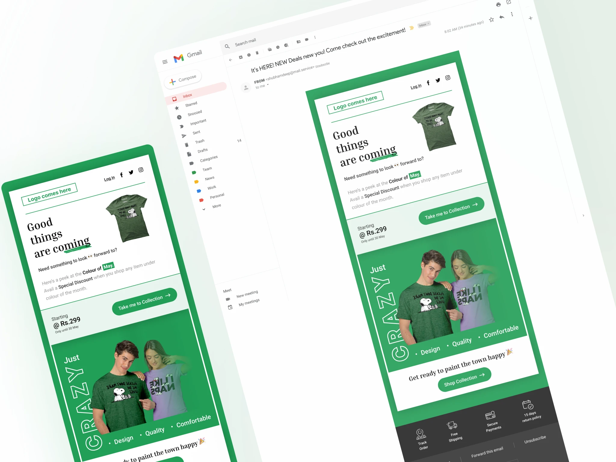
The email features a bold green color scheme aligned with the brand’s identity. The header prominently includes the logo space, navigation options, and social media links for easy access and brand recognition.
The hero section draws attention with a headline, “Good things are coming,” paired with large product images. Clear calls-to-action, like “Take me to Collection,” stand out with contrasting colors, encouraging clicks.
The design also promotes a “Color of the Month” campaign with urgency by showcasing the starting price. The playful font and balanced imagery guide the user naturally through the content, enhancing the email's appeal.
The email was tested for responsiveness on both mobile and desktop, ensuring consistent readability. The footer includes all necessary links, like order tracking and return policies, providing users with quick access to important resources.
Final Design
Final Design
The campaign successfully increased user engagement and click-through rates. The vibrant design and clear CTAs offered a seamless user experience, helping the client achieve their promotional goals. This project highlights my ability to create responsive, user-centered designs that effectively communicate promotional content.
The campaign successfully increased user engagement and click-through rates. The vibrant design and clear CTAs offered a seamless user experience, helping the client achieve their promotional goals. This project highlights my ability to create responsive, user-centered designs that effectively communicate promotional content.