Proposing a Native IOS Mobile Application Design for a Clothing Shop
Proposing a Native IOS Mobile Application Design for a Clothing Shop
Cloting Shop IOS Application
Cloting Shop IOS Application
Tools
Figma
Miro
Adobe Photoshop
Notion
4 weeks
Time frame
UX/UI Designer
Role
Mobile
Platform
Introduction
Introduction
EasyShop specializes in curating a diverse selection of clothing from a wide range of top brands. Their mission is to provide fashion enthusiasts with a seamless and enjoyable shopping experience, where they can discover the latest trends, timeless classics, and exclusive pieces all in one place.
EasyShop specializes in curating a diverse selection of clothing from a wide range of top brands. Their mission is to provide fashion enthusiasts with a seamless and enjoyable shopping experience, where they can discover the latest trends, timeless classics, and exclusive pieces all in one place.
Problem
Problem
The EasyShop faces a significant problem, the absence of a mobile application. Without a mobile application, customers miss out on the opportunity to choose clothes from the latest fashion brands and the most affordable prices.
The EasyShop faces a significant problem, the absence of a mobile application. Without a mobile application, customers miss out on the opportunity to choose clothes from the latest fashion brands and the most affordable prices.
Goal
Goal
Since the company EasyShop does not have a method to generate new customers for the offered products, the decision was made to create a mobile application that will resonate with the target audience and be a source of lead generation. The objective is to reduce frustration and to give customers an enjoyable shopping experience with EasyShop.
Since the company EasyShop does not have a method to generate new customers for the offered products, the decision was made to create a mobile application that will resonate with the target audience and be a source of lead generation. The objective is to reduce frustration and to give customers an enjoyable shopping experience with EasyShop.
My Role
My Role
I was responsible for the competitor analysis, the creation of the avatar of the target audience based on the details provided by the client, wireframing, UI Design and handoff. I also created a style guide to maintain consistency and effective communication with the development team.
I was responsible for the competitor analysis, the creation of the avatar of the target audience based on the details provided by the client, wireframing, UI Design and handoff. I also created a style guide to maintain consistency and effective communication with the development team.
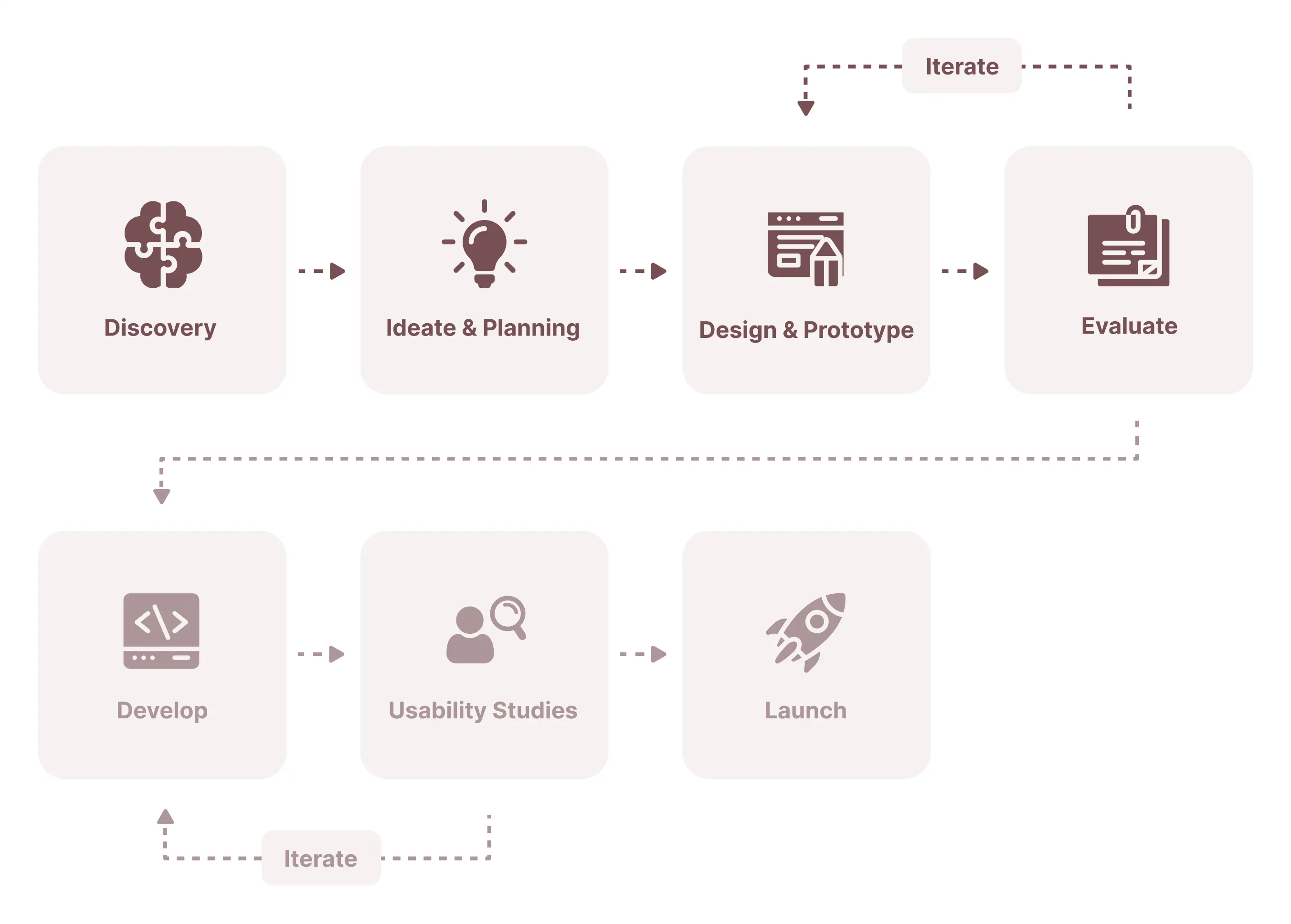
My Process
My Process
The structure and length of my process depend on at which point I join the team, the resources available, and the deadlines. Because of the short timeframe, I focused only on the first 4 phases of my product design process.
The structure and length of my process depend on at which point I join the team, the resources available, and the deadlines. Because of the short timeframe, I focused only on the first 4 phases of my product design process.
User Research
User Research
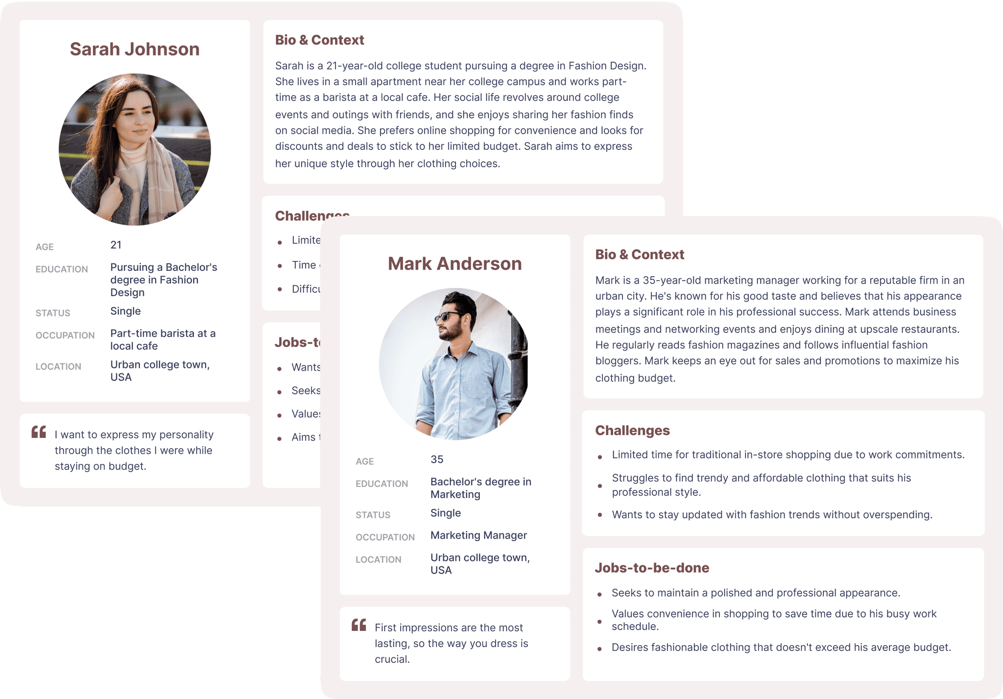
User persona
As you can see in my work process I always start any project with the target audience and competitor analysis part to make sure the problem we want to solve is a current one and if the design idea resonates with the end user.
We have identified two end users of this site based on the information provided by the client. We included the most important data: demographics and psychographics to better understand the motives, frustrations, and desires of the users and address them further in the design.
After analyzing the target users, I reached some conclusions:
Limited Time: Due to college or work, both users have limited time to spend on shopping. The best way to save time is to add a filter and search bar, so the user will save time searching for clothes.
Budges Restrictions: Both users have difficulties in finding affordable clothes. We should present the special offers and discounts. Because users can identify and purchase clothes at a price according to their budget.
Diverse Style Goals: Sarah seeks affordable personal style, while Mark aims for a lasting professional impression. Provide a variety of products in the app to cater to different user preferences.
Value of Convenience: Both prioritize convenient shopping due to busy lifestyles. Ensure a well-organized user flow for smooth navigation.
User Preferences: Users struggle to find trendy clothes that suit their style. We should add a wide range of products and suppliers so that users can identify the most trendy clothes.
Competitor research
After I finished with the user flow, I started the competitor analysis. Competitor analysis allows us to analyze how other companies have approached the same problem, what their strengths are, and where we can do things better. We analyzed the sites by UI and UX at the top 5 direct competitors(Zaful, Asos, Zara, Depop, and Shein).
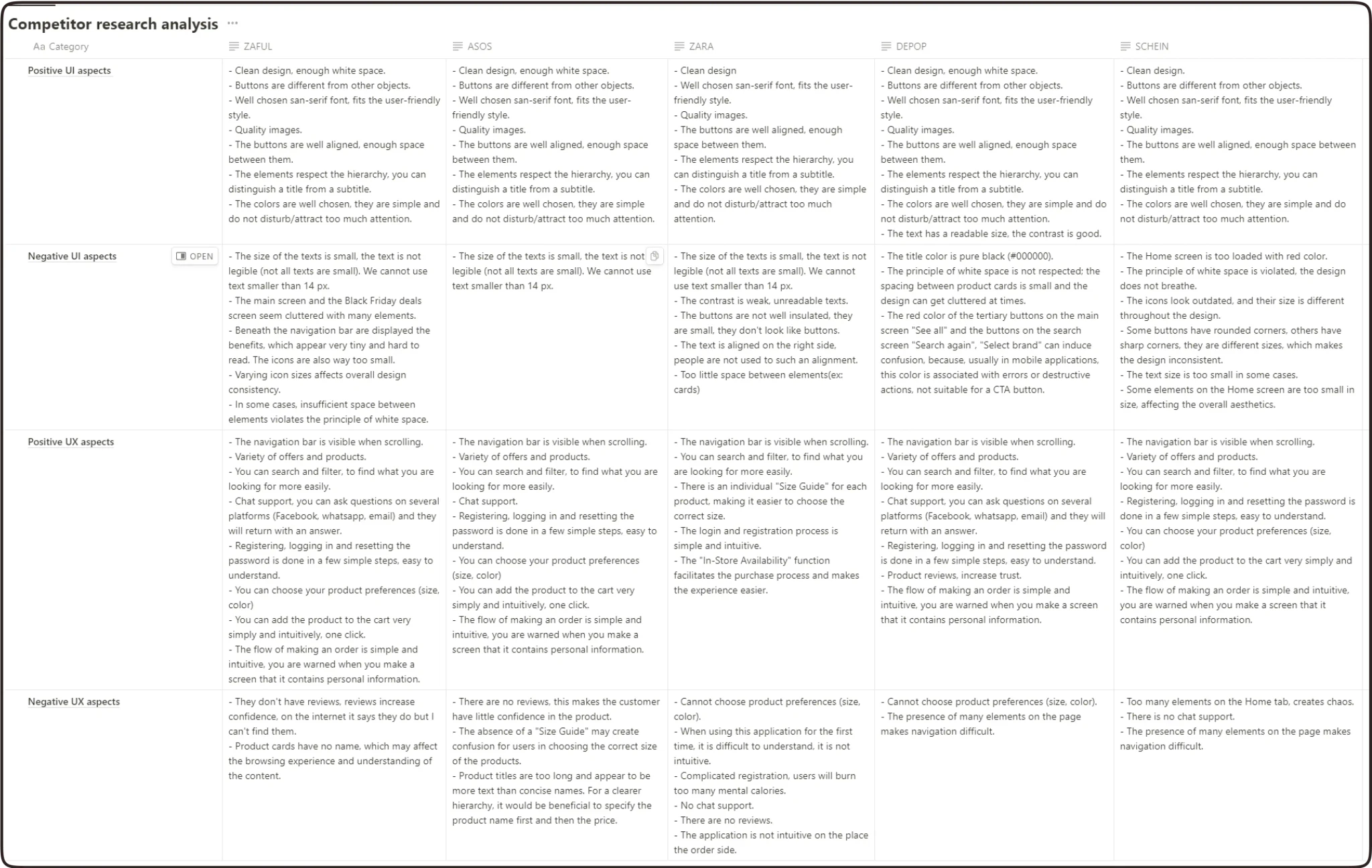
After performing the analysis of the competition, I reached the following conclusions:
UX Conclusions:
- Registration, logging in and resetting the password must be in as less steps possible, simple to understand and use.
- The possibility of registering with recovery e-mail.
- Attractive design, easy to use and understand.
- Add a searching bar and a filter for the app to be less time consuming.
- The possibility to choose product preferences (color and size).
- Adding to the cart or placing a order scenarios should be in less steps as possible.
- Additionally, the product should include a testimonials section for the product to enhance credibility (social proof trigger).
UI Conclusions:
- Because we design a IOS native application, we should use San-Francisco font witch is the basic font for IOS interface.
- Text should be readable size (minim 14px for body text) and has good contrast.
- Respect the UI principles - hierarchy and white space.
- Colors should be in a user-friendly style.
- Choose high quality images.
- According to the client's request, we have design a native mobile application for IOS, using elements based on Human Interface Guidelines. The custom elements must still be with aspects from the IOS KIT.
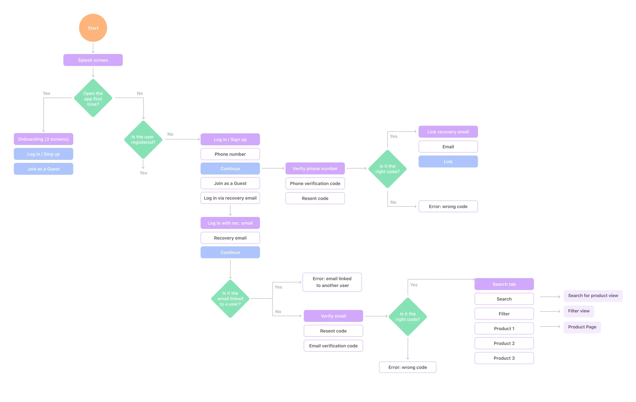
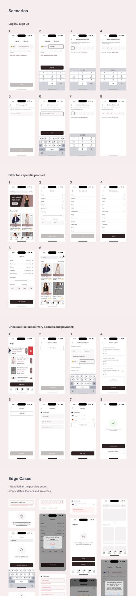
User Flow
After I finished with the analysis of the target users, I stated the user flow, which brought a better understanding of the app’s main functionality, number of screens, happy scenarios, and edge cases and further simplified the wireframing and UI Design Process. I created the user flow for the following scenarios:
Onboarding;
Log in / Sign up;
Main Tabs;
Search for a specific product;
Filter by price range, gender, type, or style;
Add a product to the bag;
Checkout (select the delivery type, and address and make the payment).
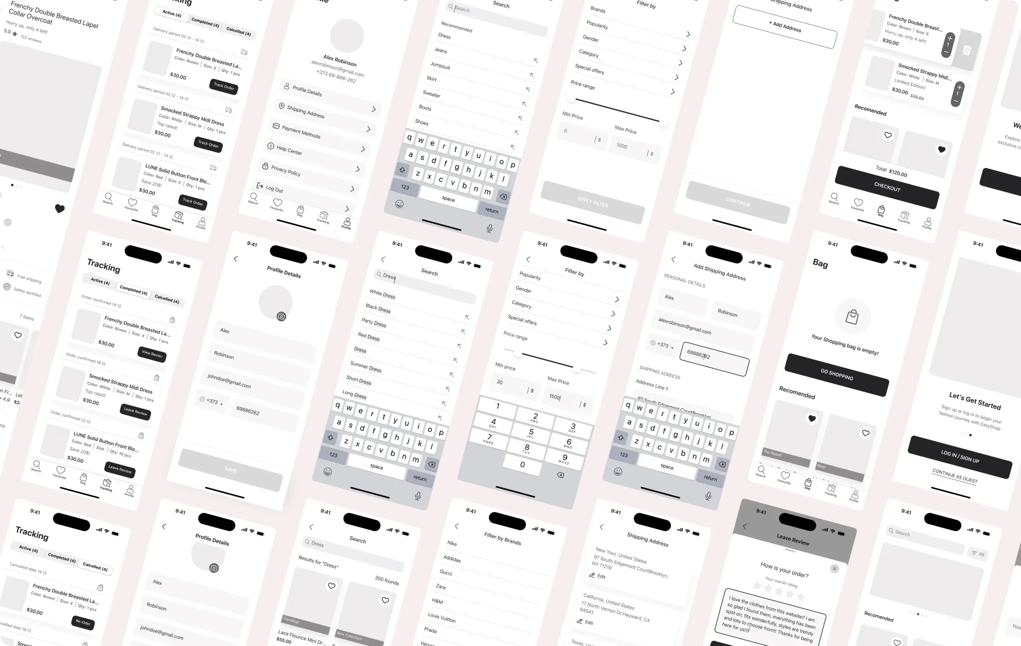
High-Fidelity Wireframing
After getting a deeper understanding of the target audience and competitors I created a wireframe to visualize the site structure and the content part.
Thanks to wireframing we have identified the basic sections and structured them in a way that resonates with the end user.
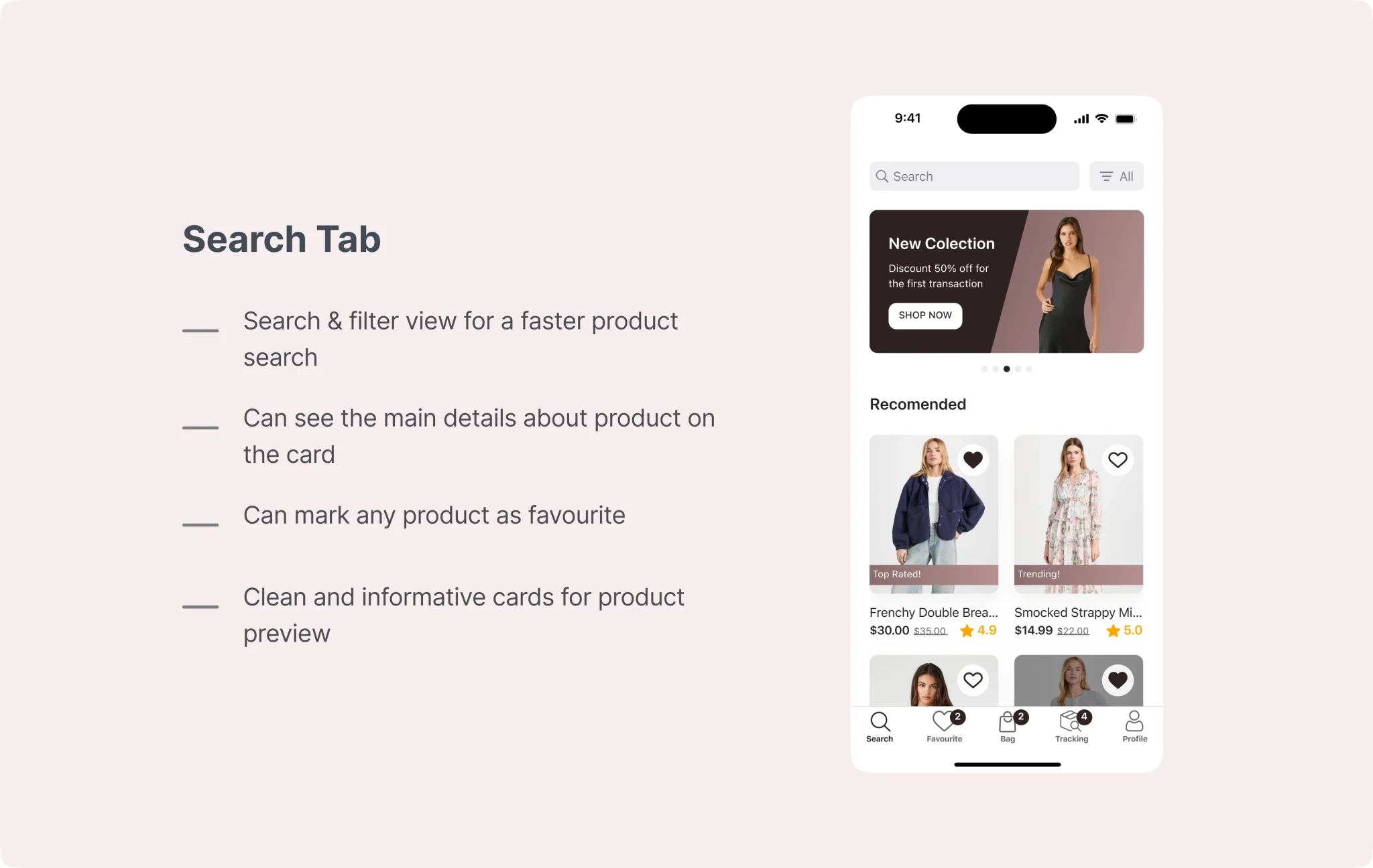
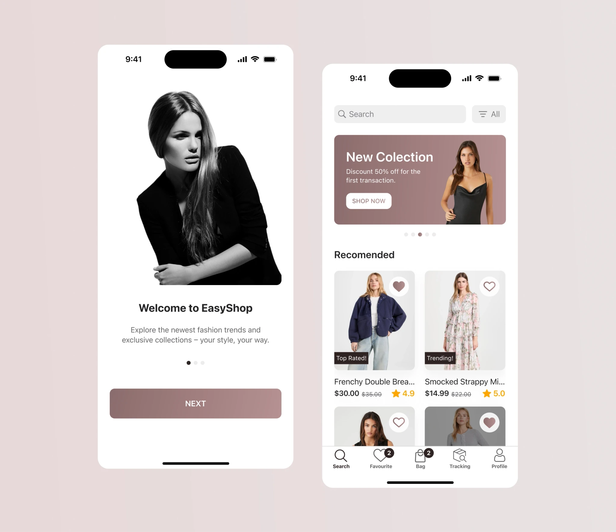
UI Design
Before starting to design UI, I looked for inspiration on Dribbble, Behance, and Pinterest and created an inspirational mood board. It helped me avoid the creative block and saved a lot of time during the design process.
After several rounds of iterations, I came to this design.

Style guide
After confirming the final design we developed a style guide to maintain consistency throughout the project and subsequent projects. Also, a style guide facilitates more effective communication with the engineers.
I have included the typographic system, the color palette created based on MUI, the components used, and the icons.
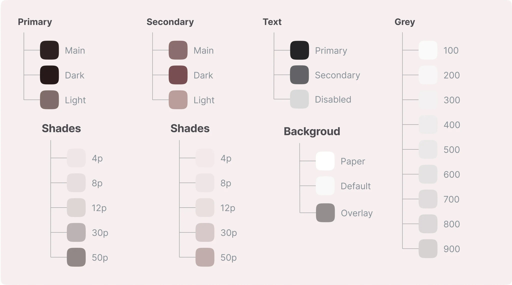
Colors
Colors
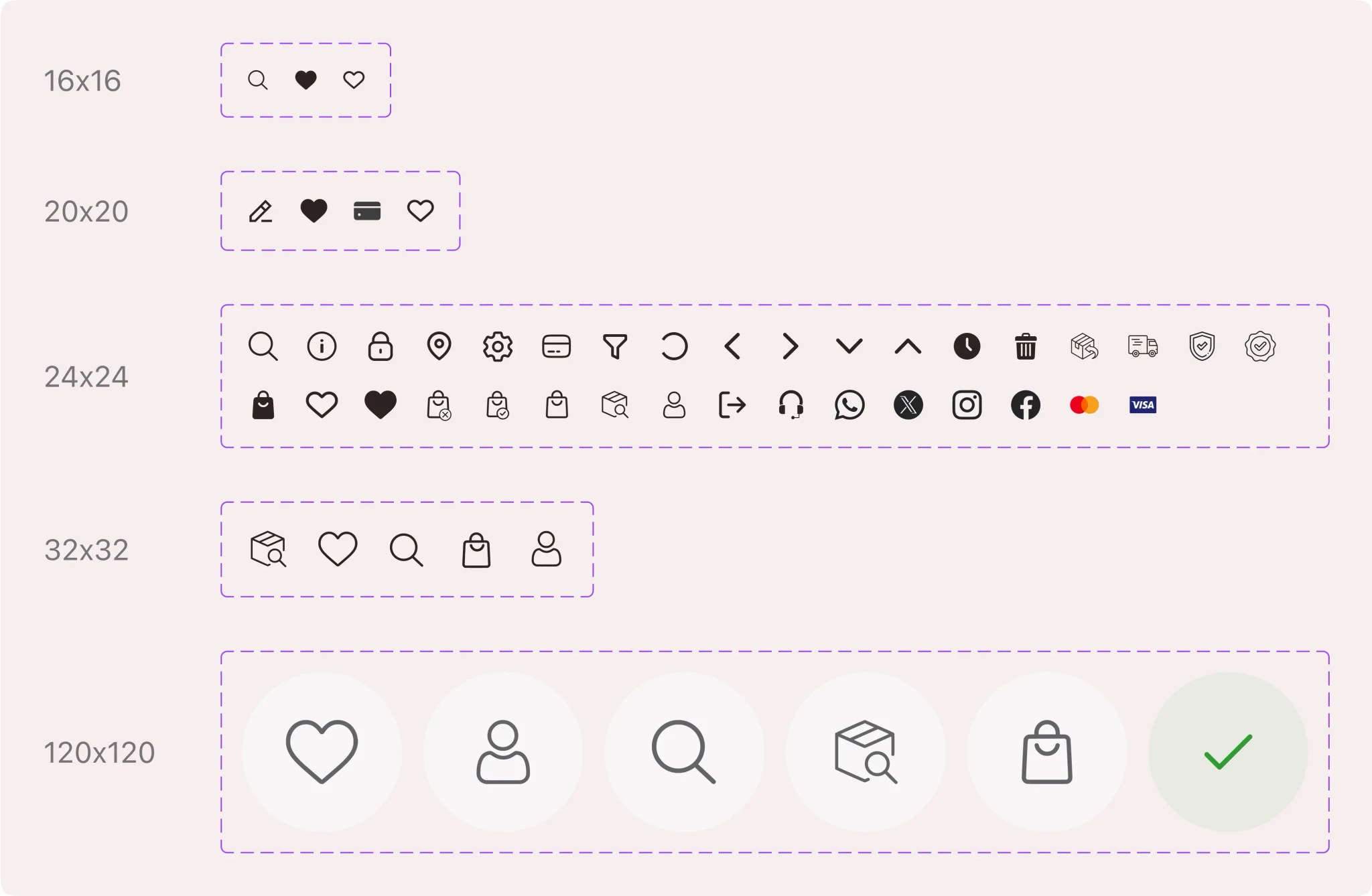
Icons
Icons
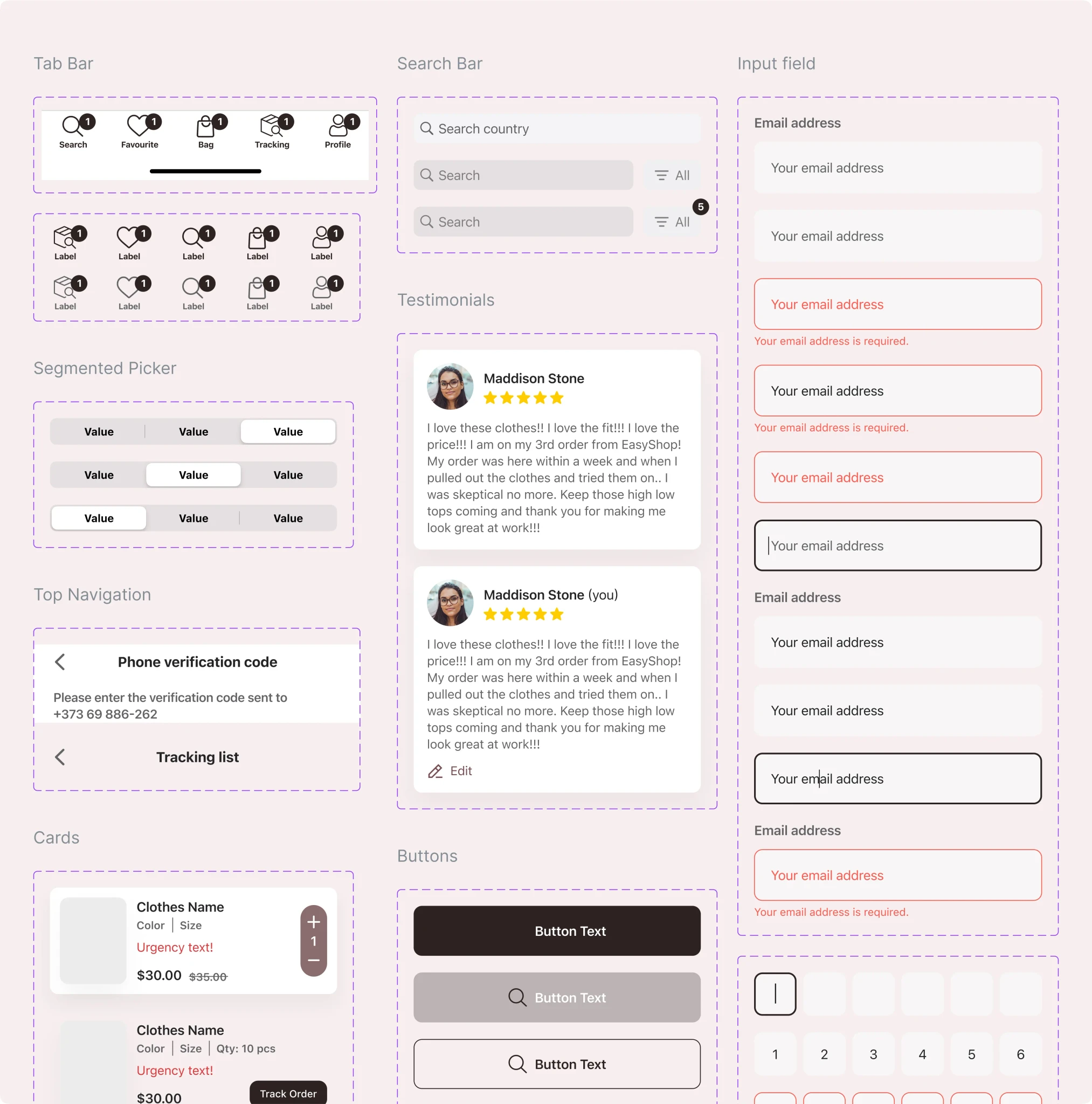
Components
Components
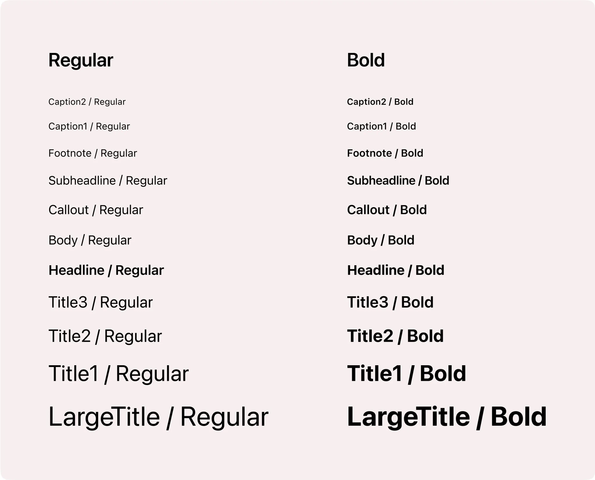
Typography: San Francisco Pro Text & San Francisco Pro Display
Typography: San Francisco Pro Text & San Francisco Pro Display
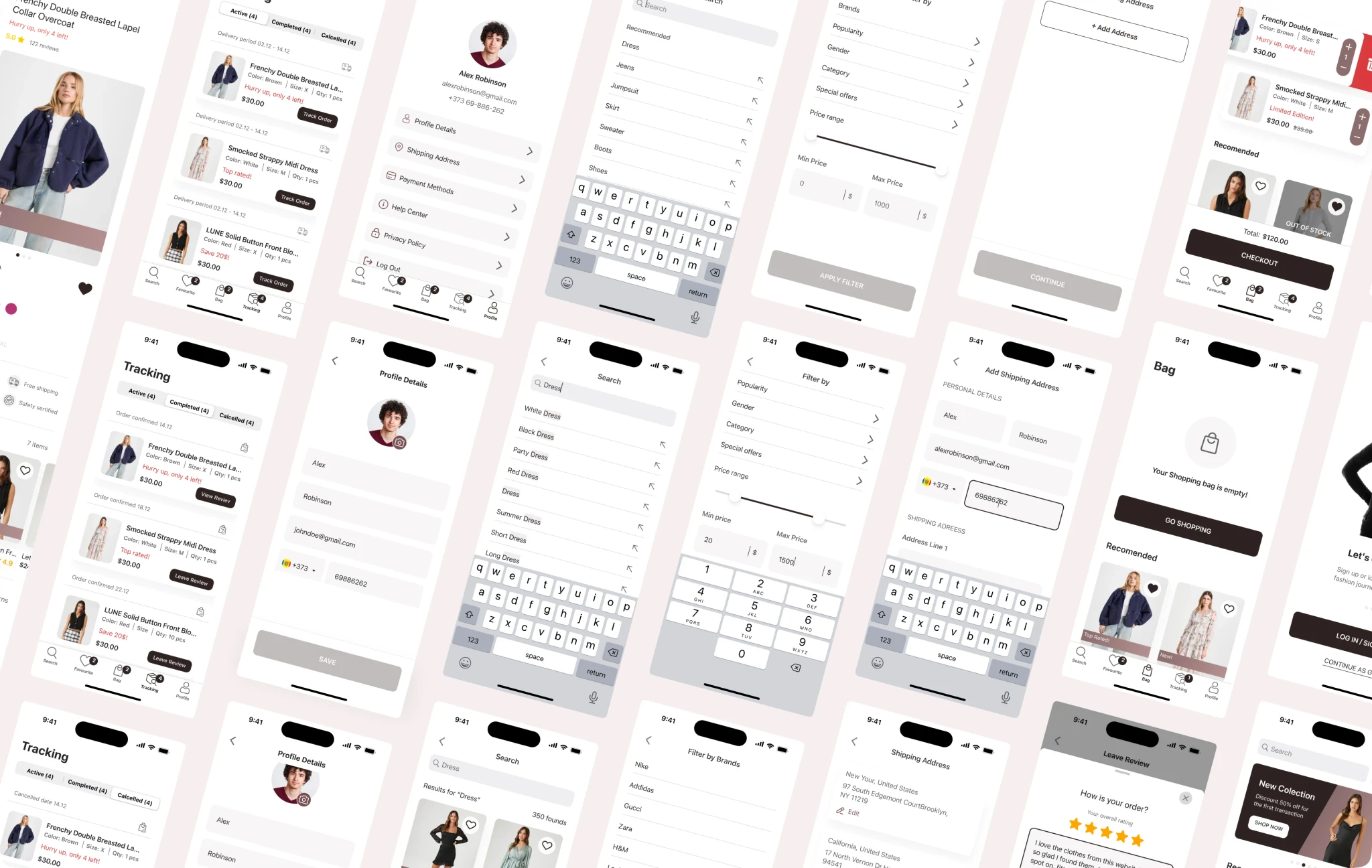
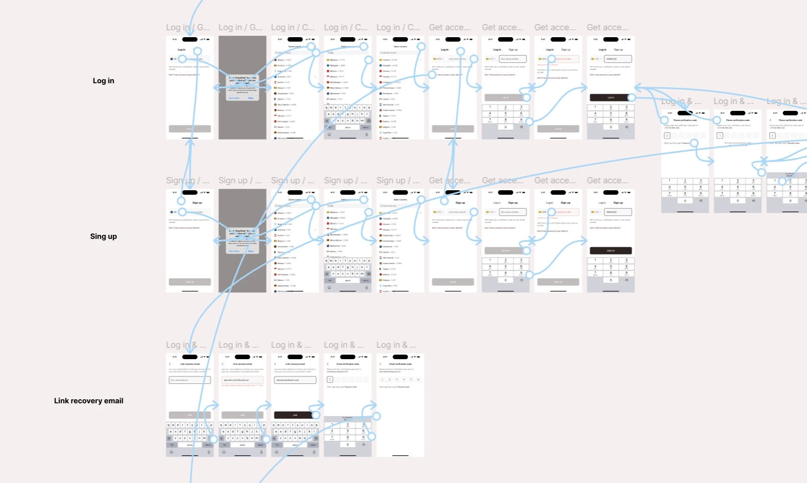
Prototype
After finishing the UI part, I put together a realistic prototype for user testing and scenario validation.
Prototyping helps us find and fix usability issues, streamline user flows, and create a smooth, intuitive experience for the end user.
Please see the following image:
Prototype
After finishing the UI part, I put together a realistic prototype for user testing and scenario validation.
Prototyping helps us find and fix usability issues, streamline user flows, and create a smooth, intuitive experience for the end user.
Please see the following image:
Handoff
Finally, I have successfully organized the file in a highly intuitive manner. In addition to this, I have also included the final design along with the responsive version, providing detailed specifications of the sizes used.
To ensure complete understanding and seamless implementation, I have arranged a call with the developer. This call will serve as an opportunity to provide any additional details about the site that may be necessary for its implementation.
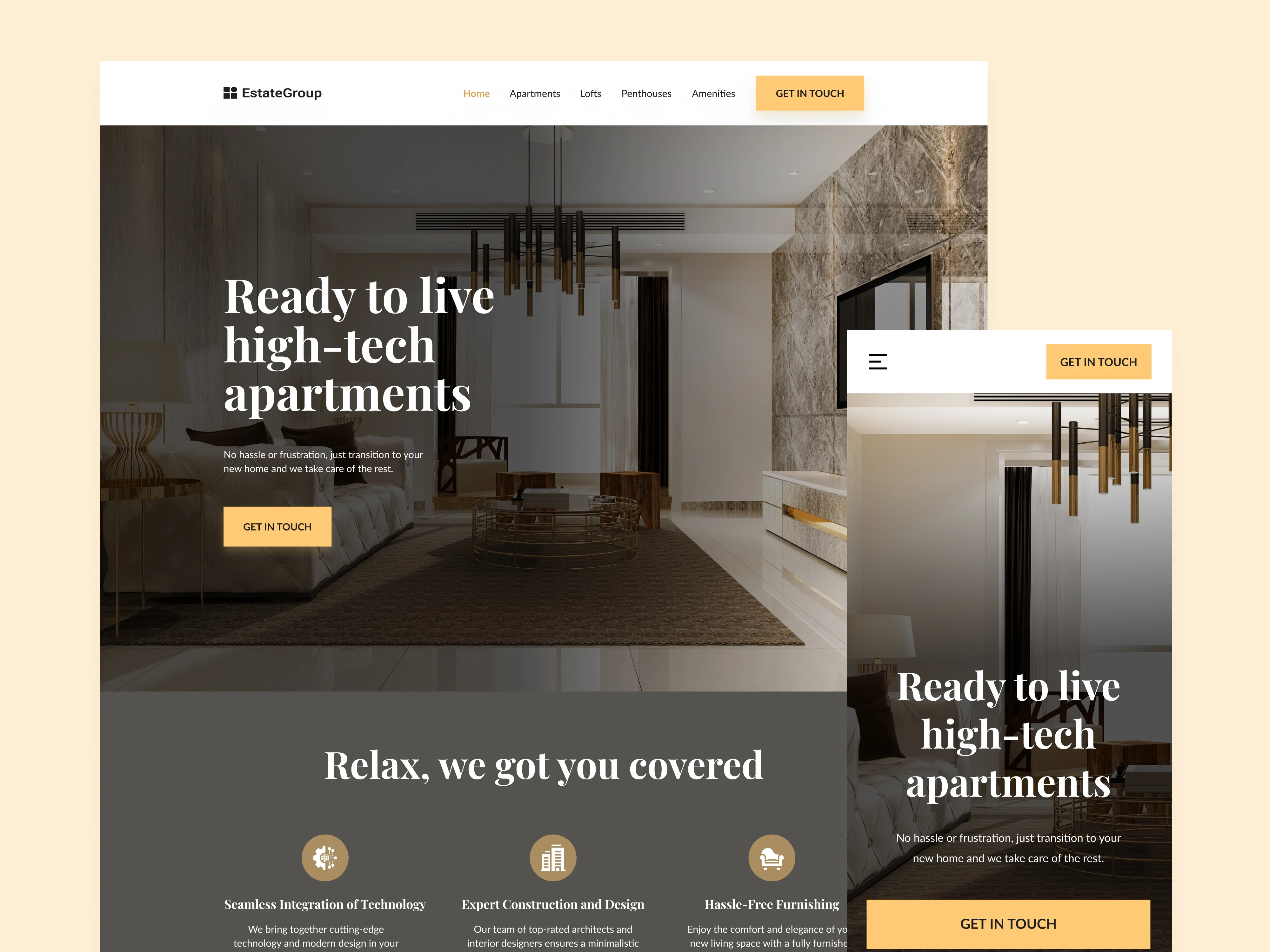
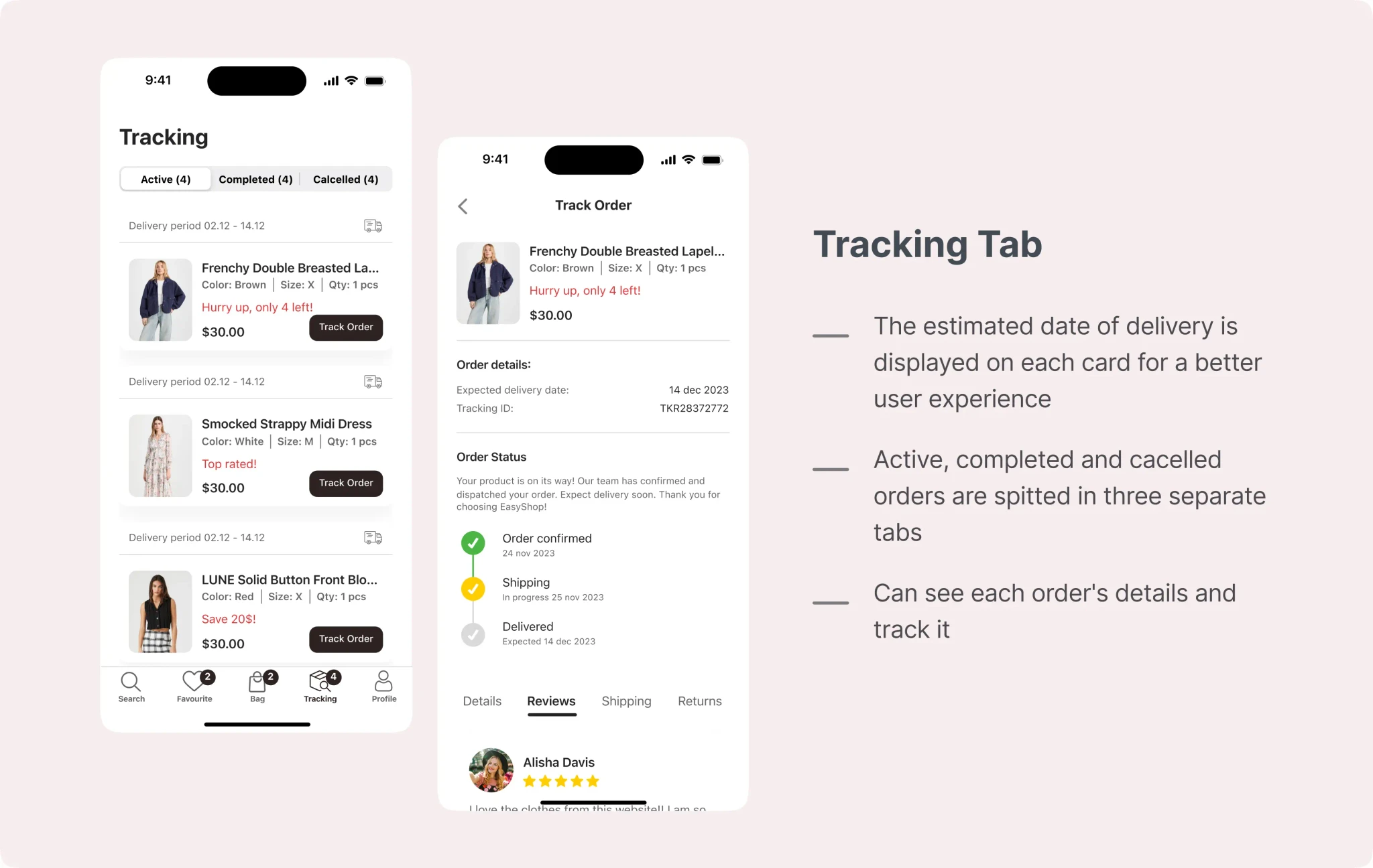
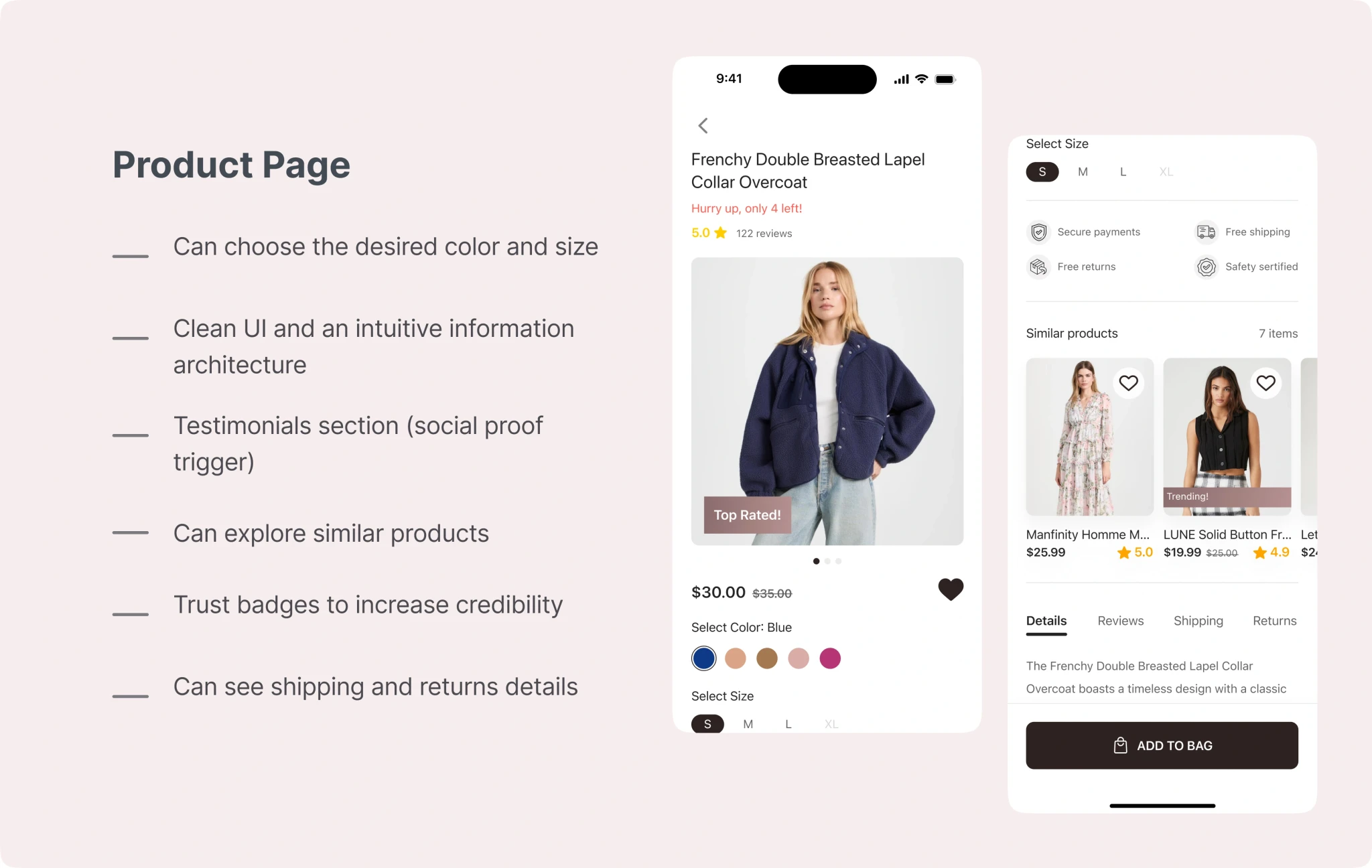
UI Design
Before starting to design UI, I looked for inspiration on Dribbble, Behance, and Pinterest and created an inspirational mood board. It helped me avoid the creative block and saved a lot of time during the design process.
After several rounds of iterations, I came to this design.
UI Design
Before starting to design UI, I looked for inspiration on Dribbble, Behance, and Pinterest and created an inspirational mood board. It helped me avoid the creative block and saved a lot of time during the design process.
After several rounds of iterations, I came to this design.