Proposing a Better Design Solution for a Luxury Real Estate Company
Proposing a Better Design Solution for a Luxury Real Estate Company
Real Estate Landing Page
Real Estate Landing Page
Tools
Figma
Miro
Adobe Photoshop
Notion
3 weeks
Time frame
UX/UI Designer
Role
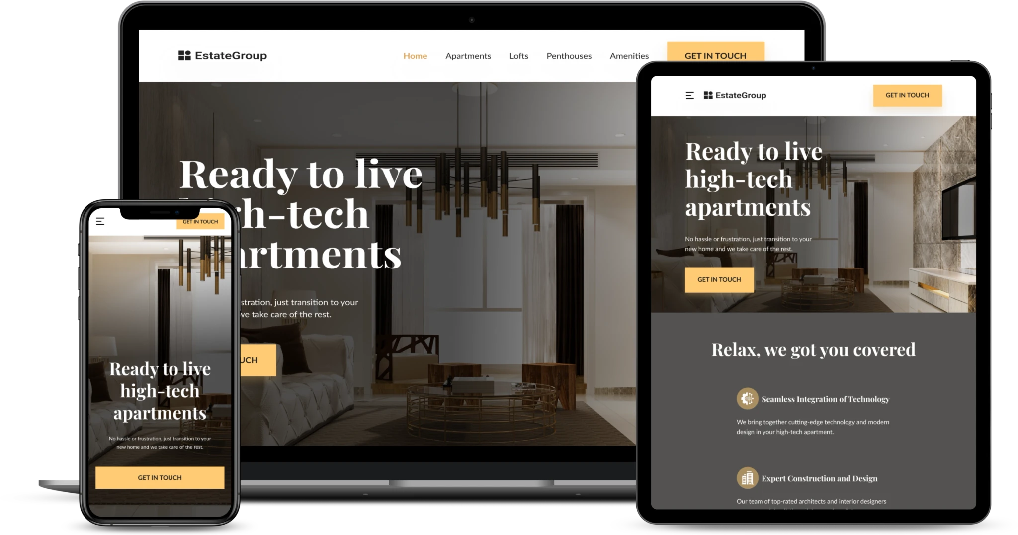
Desktop, Tablet & Mobile
Platform
Introduction
Introduction
Estate Group specializes in providing comprehensive solutions for minimalistic high-tech apartments. Their services encompass everything from the initial design phase to the final construction details. They collaborate with top architects and interior designers to blend cutting-edge technology and modern design seamlessly.
Estate Group specializes in providing comprehensive solutions for minimalistic high-tech apartments. Their services encompass everything from the initial design phase to the final construction details. They collaborate with top architects and interior designers to blend cutting-edge technology and modern design seamlessly.
Problem
Problem
The Estate Group faces a significant problem, the absence of a website. Without an online website, customers miss out on essential information about their services and find it difficult to choose the right apartments.
The Estate Group faces a significant problem, the absence of a website. Without an online website, customers miss out on essential information about their services and find it difficult to choose the right apartments.
Goal
Goal
The objective was to create the visual UI design and layout for the company's website within a 4-week timeframe. This website will serve as a platform where clients can easily access detailed information about our services, browse available apartments, and streamline the entire apartment-finding process. The goal is to enhance the client experience, reduce frustration, and ultimately increase the efficiency of securing ideal living spaces.
The objective was to create the visual UI design and layout for the company's website within a 4-week timeframe. This website will serve as a platform where clients can easily access detailed information about our services, browse available apartments, and streamline the entire apartment-finding process. The goal is to enhance the client experience, reduce frustration, and ultimately increase the efficiency of securing ideal living spaces.
My role
My role
I was responsible for the competitor analysis, the creation of the avatar of the target audience based on the details provided by the client, wireframing, UI Design and handoff. I also created a style guide to maintain consistency and effective communication with the development team.
I was responsible for the competitor analysis, the creation of the avatar of the target audience based on the details provided by the client, wireframing, UI Design and handoff. I also created a style guide to maintain consistency and effective communication with the development team.
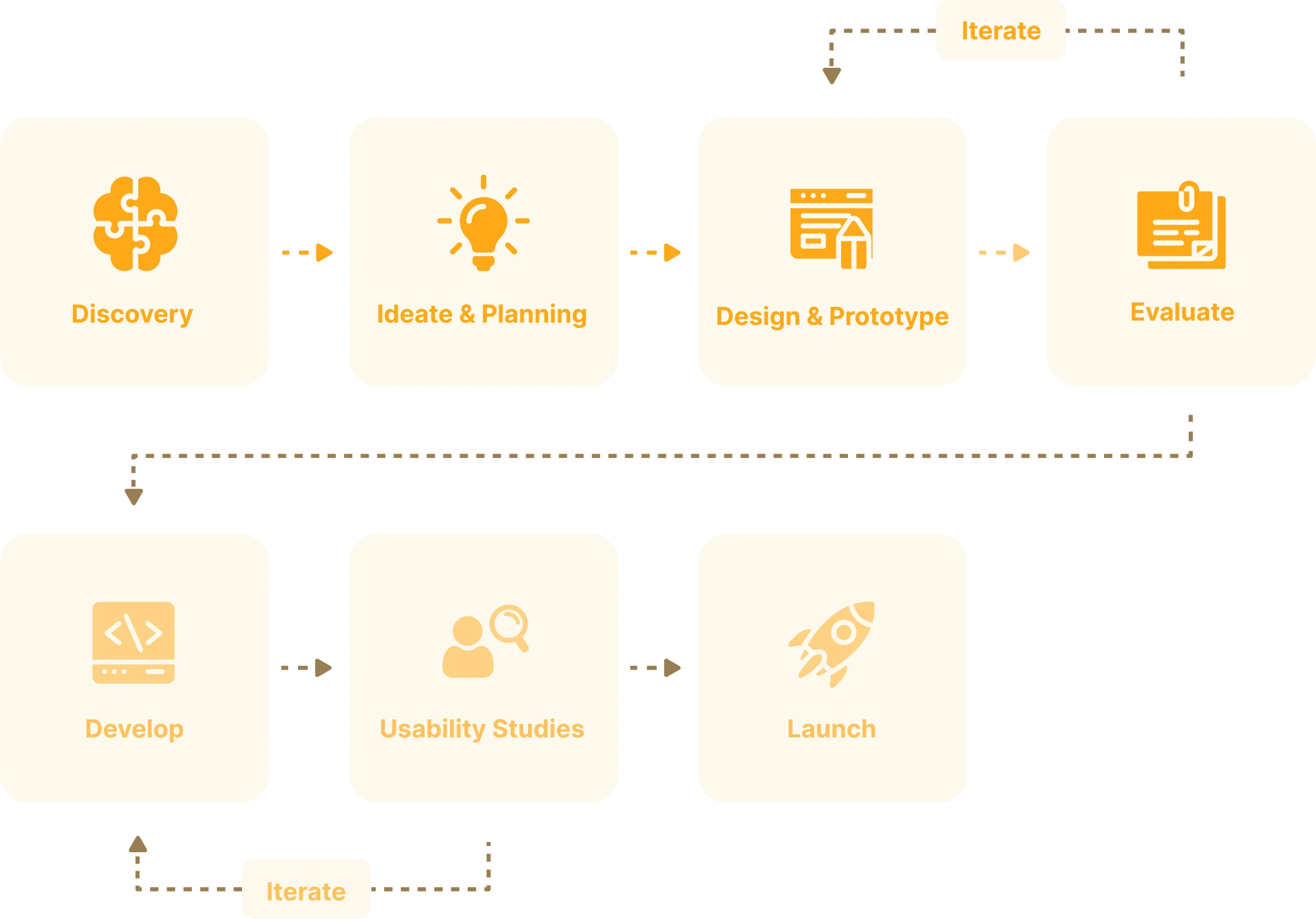
My process
My process
The structure and length of my process depend on at which point I join the team, the resources available, and the deadlines. Because of the short timeframe, I focused only on the first 4 phases of my product design process.
The structure and length of my process depend on at which point I join the team, the resources available, and the deadlines. Because of the short timeframe, I focused only on the first 4 phases of my product design process.
User research
User research
User persona
As you can see in my work process I always start any project with the target audience and competitor analysis part to make sure the problem we want to solve is a current one and if the design idea resonates with the end user.
We have identified two end users of this site based on the information provided by the client. We included the most important data: demographics and psychographics to better understand the motives, frustrations and desires of the users and address them further in the design.
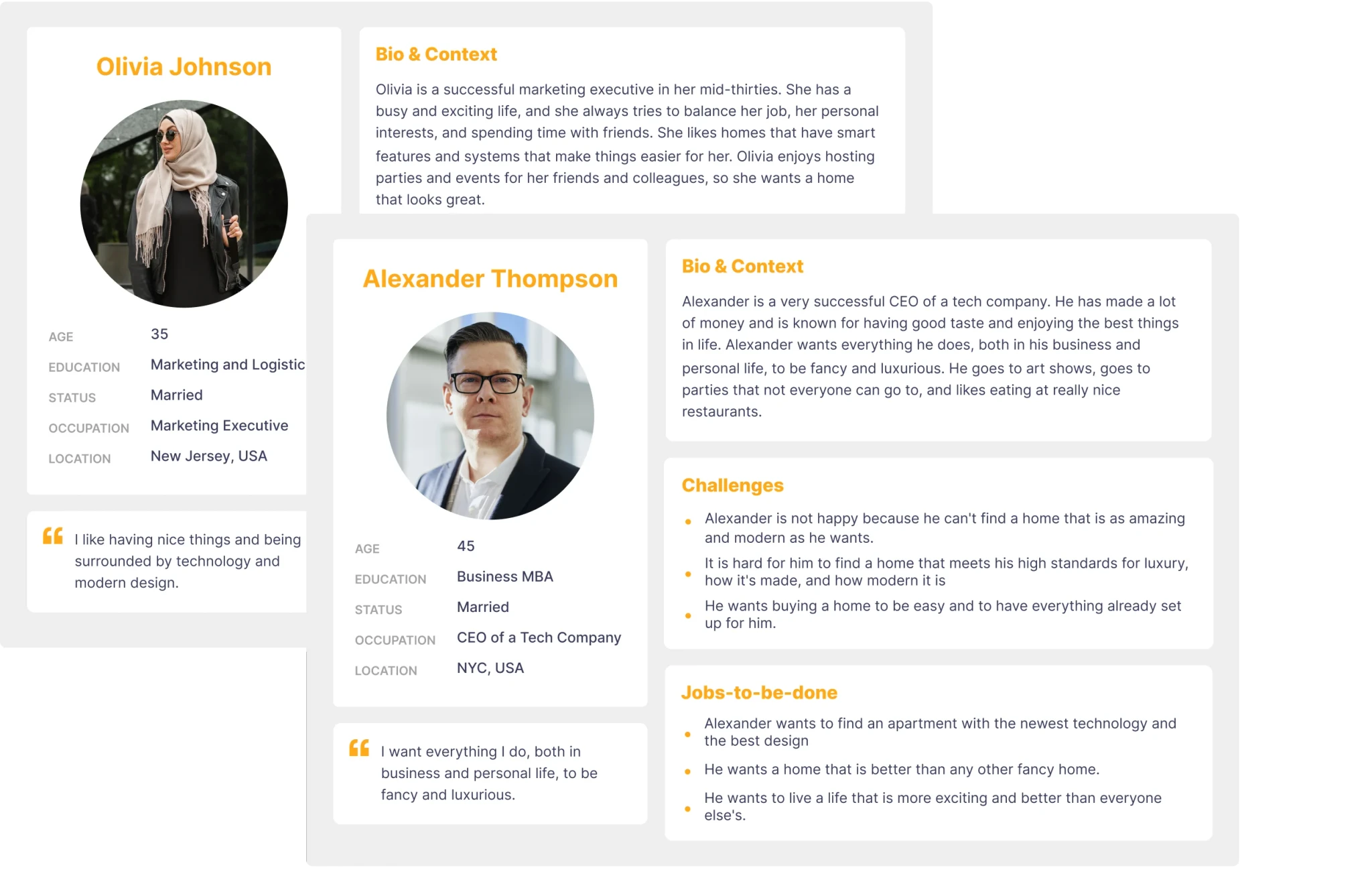
After analyzing the target users, I reached some conclusions::
User Preferences: Both user categories have a preference for luxurious and elegant items. We should communicate those values through the website UI within the first 5 sec.
Age-Appropriate Design: Users are aged 35 & 45 so we need to make sure the text is easily readable in size and contrast.
Convenience: Both sets of users highly value convenience and prefer turnkey solutions. To meet their preferences, we can effectively address these preferences through meticulous copywriting and an instructive video elucidating our workflow.
Competitor research
After I finished with the analysis of the target users, I started the competitor analysis. Competitor analysis allows us to analyze how other companies have approached the same problem, what their strengths are, and where we can do things better. We analyzed the sites by UI and UX at the top 5 direct competitors.
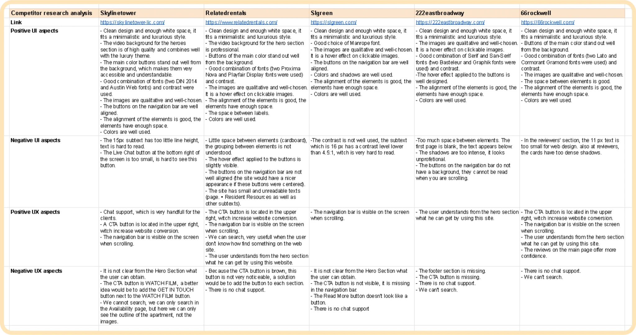
After performing the analysis of the competition, I reached the following conclusions:
UI Conclusions
Font Selection: Use a combination of serif and sans-serif fonts for a luxury theme.
Readability: Ensure the text is of an easily readable size and has good contrast.
Design Cleanliness: Maintain a clean design with enough white space to fit a minimalistic and luxurious theme.
Media Quality: Use high-quality images and videos that harmonize well with the theme.
Element Alignment: Ensure elements are well-aligned.
Color Scheme: Colors must align with the luxury theme and be pleasant for users.
UX Conclusions
CTA Button Placement: Place a CTA button in the top left of the page to respect the Z formation, which could increase website conversions.
Navigation Bar: Position the navigation bar at the top of the site and keep it visible when users scroll.
Hero Section Content: Ensure the hero section addresses the questions: “Who we are?”, “What do we do?” and “How can we help you?” Users should clearly understand what they can obtain from the website.
CTA Buttons: Add a CTA button to each section, providing users the opportunity to click on these buttons regardless of where they are on the page.
Testimonials Section: Include a testimonials section to enhance credibility (social proof trigger).
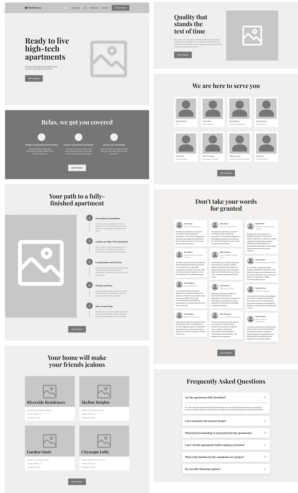
High-Fidelity Wireframing
After getting a deeper understanding of the target audience and competitors I created a wireframe to visualize the site structure and the content part.
Thanks to wireframing we have identified the basic sections and structured them in a way that resonates with the end user.
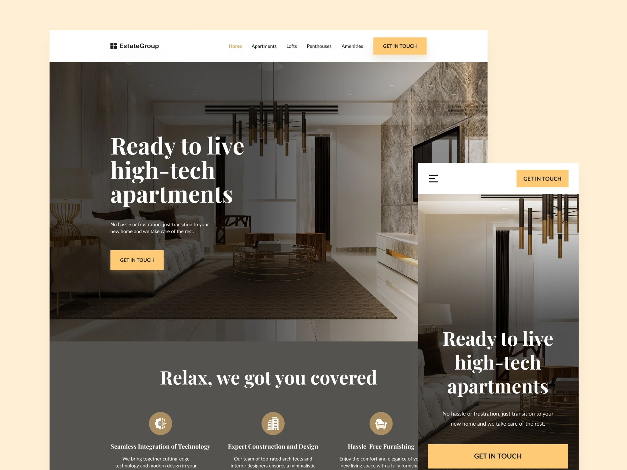
UI Design
Once I confirmed the structure of the site, I created the design of the first two sections in several variations to identify which style fits best. I tried both the luxury and user-friendly styles. In the end I chose the Luxury style as it better represents the company image and the product offered.
LAYOUT 1 (user-friendly style)
LAYOUT 1 (user-friendly style)
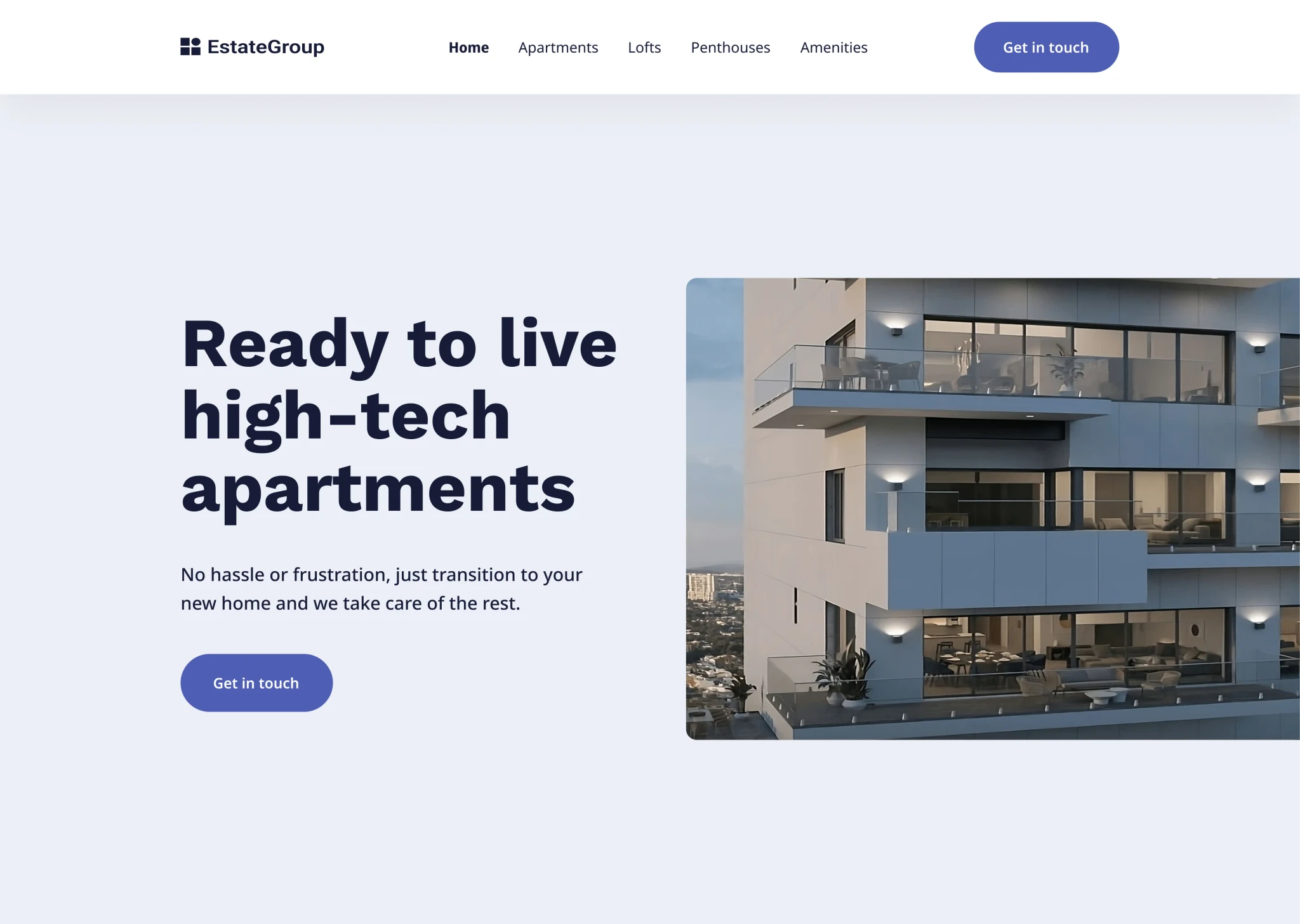
LAYOUT 2 (user-friendly style)
LAYOUT 1 (user-friendly style)
LAYOUT 2 (user-friendly style)
LAYOUT 2 (user-friendly style)
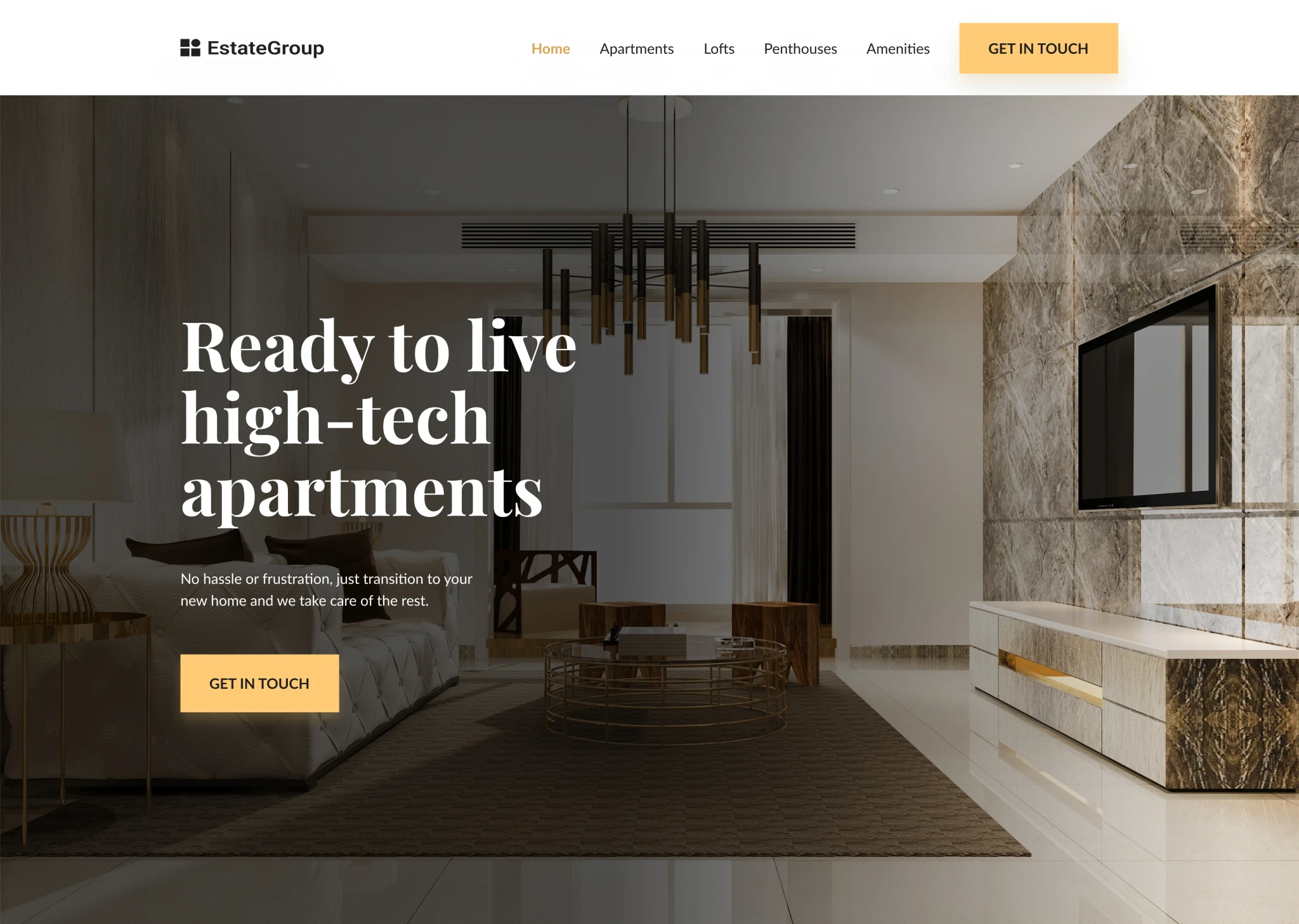
I continued with the Luxury style for the rest of the sections to maintain a consistent and elegant design throughout the entire website.
I continued with the Luxury style for the rest of the sections to maintain a consistent and elegant design throughout the entire website.
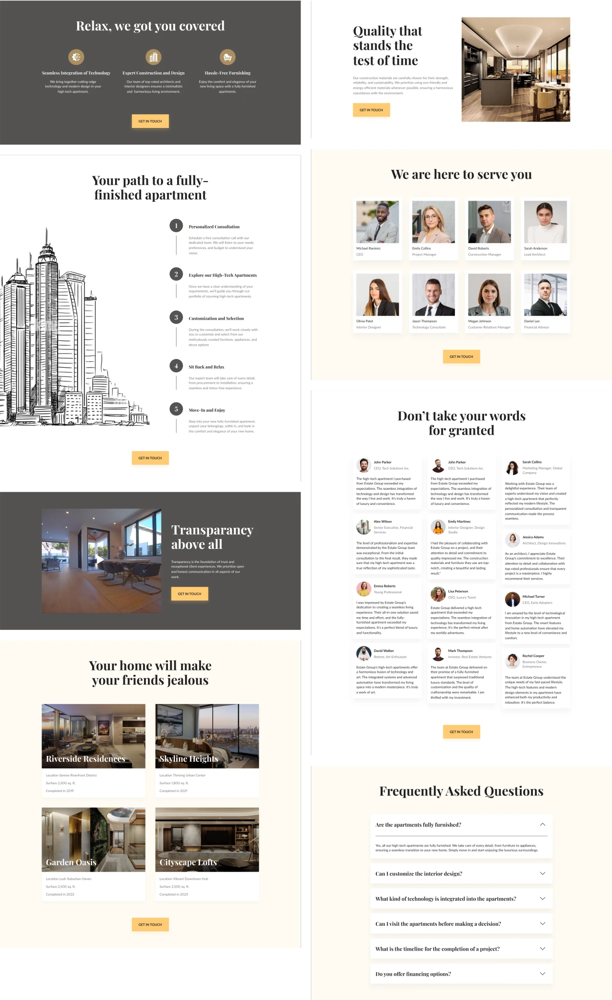
We also created the tablet and phone version because 40% of users will access the site from a phone (data based on target audience analysis).
We also created the tablet and phone version because 40% of users will access the site from a phone (data based on target audience analysis).
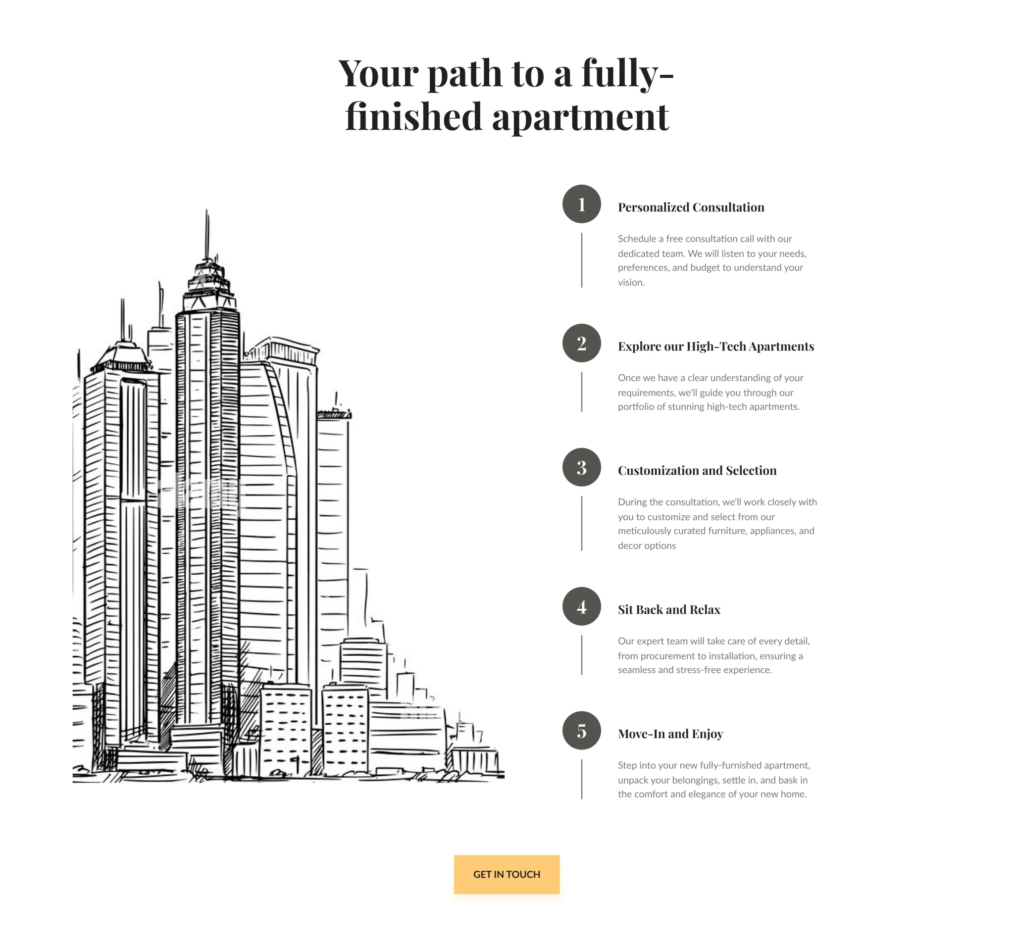
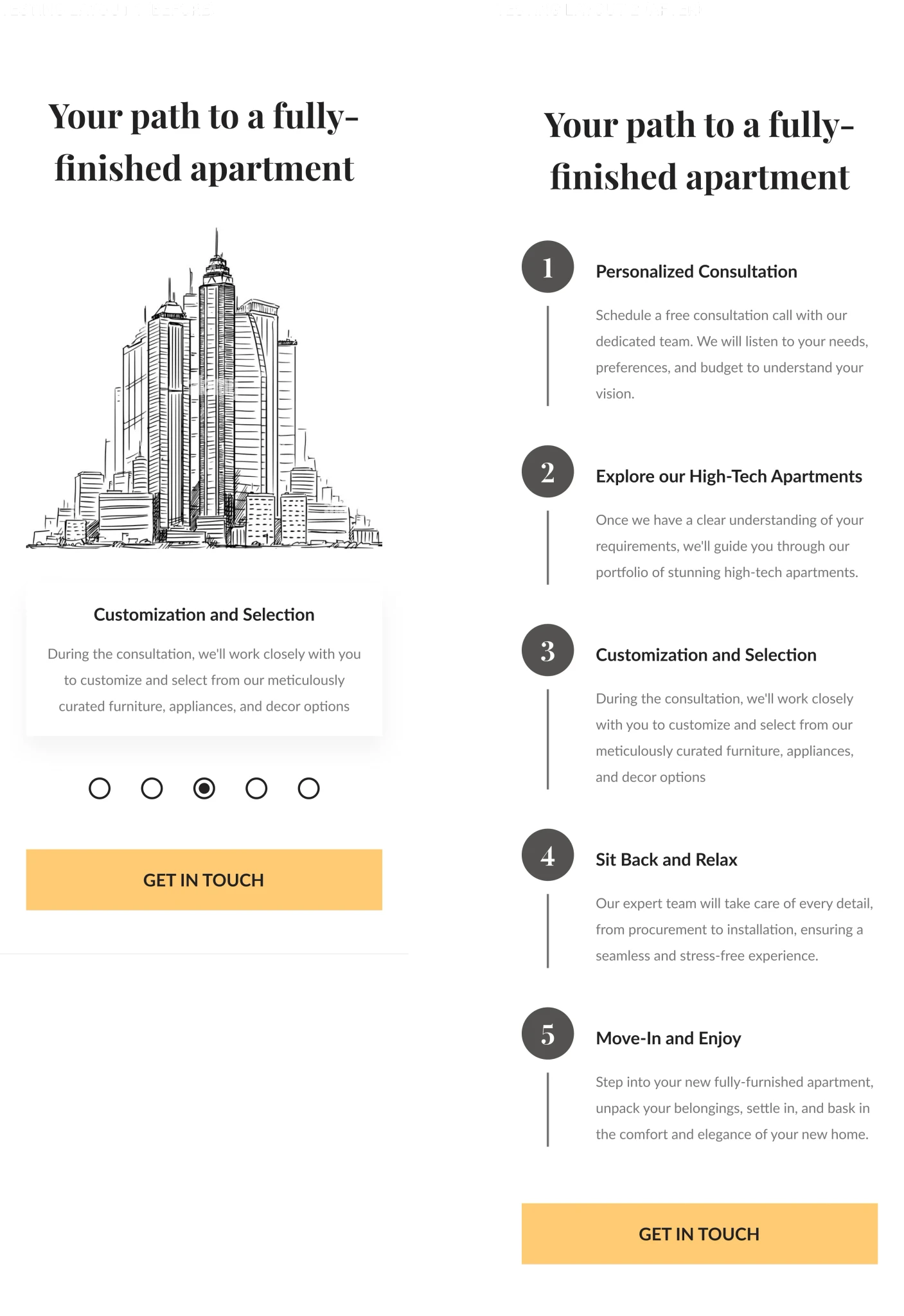
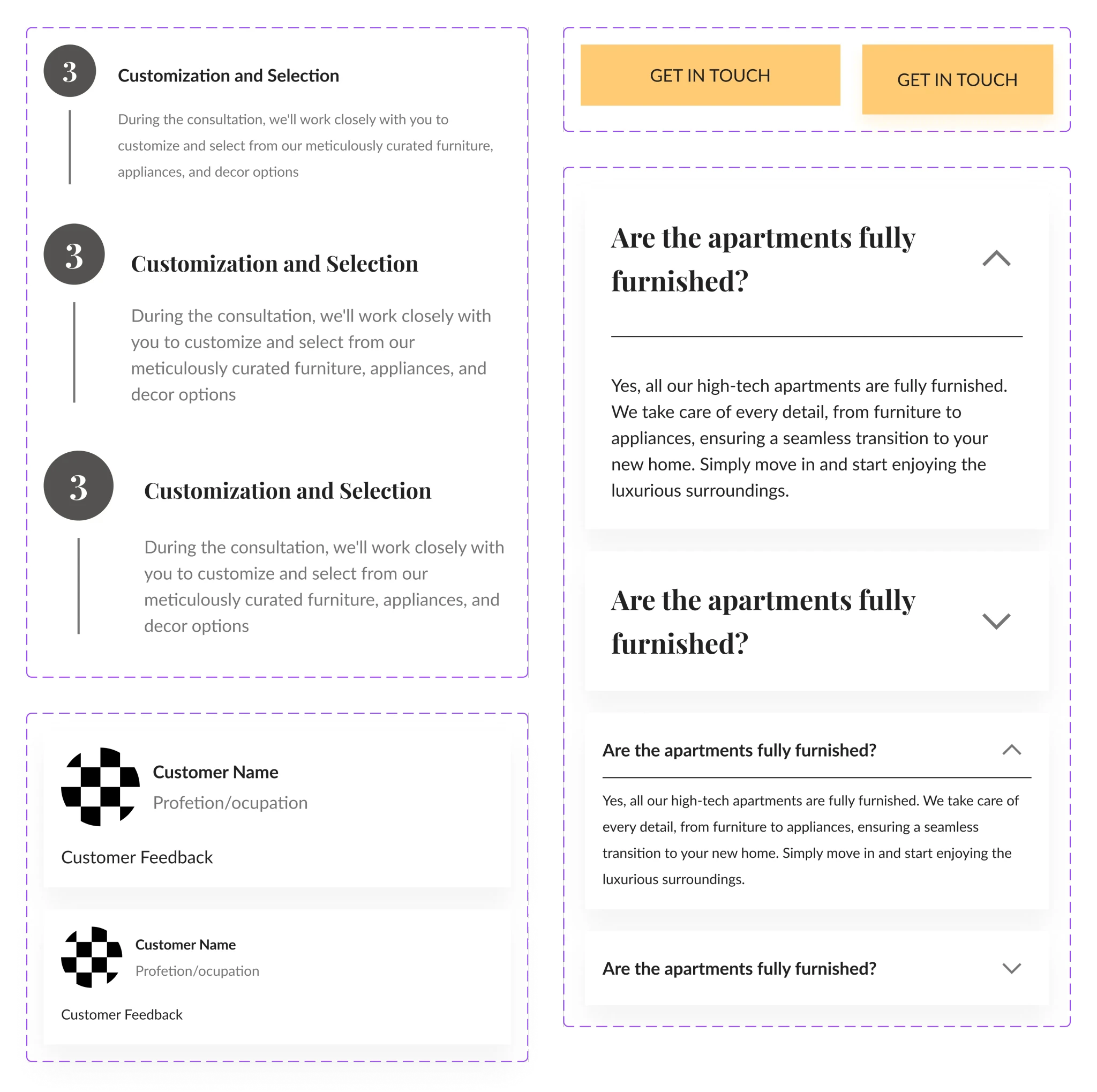
How it Works section
- Step-by-step plan to guide users in choosing the right apartment option and reducing frustration.
- Very clear and consistent CTA button “Get in touch”.
- Serif font for titles to create a luxury and professional vibe.
How it Works section
- Step-by-step plan to guide users in choosing the right apartment option and reducing frustration.
- Very clear and consistent CTA button “Get in touch”.
- Serif font for titles to create a luxury and professional vibe.
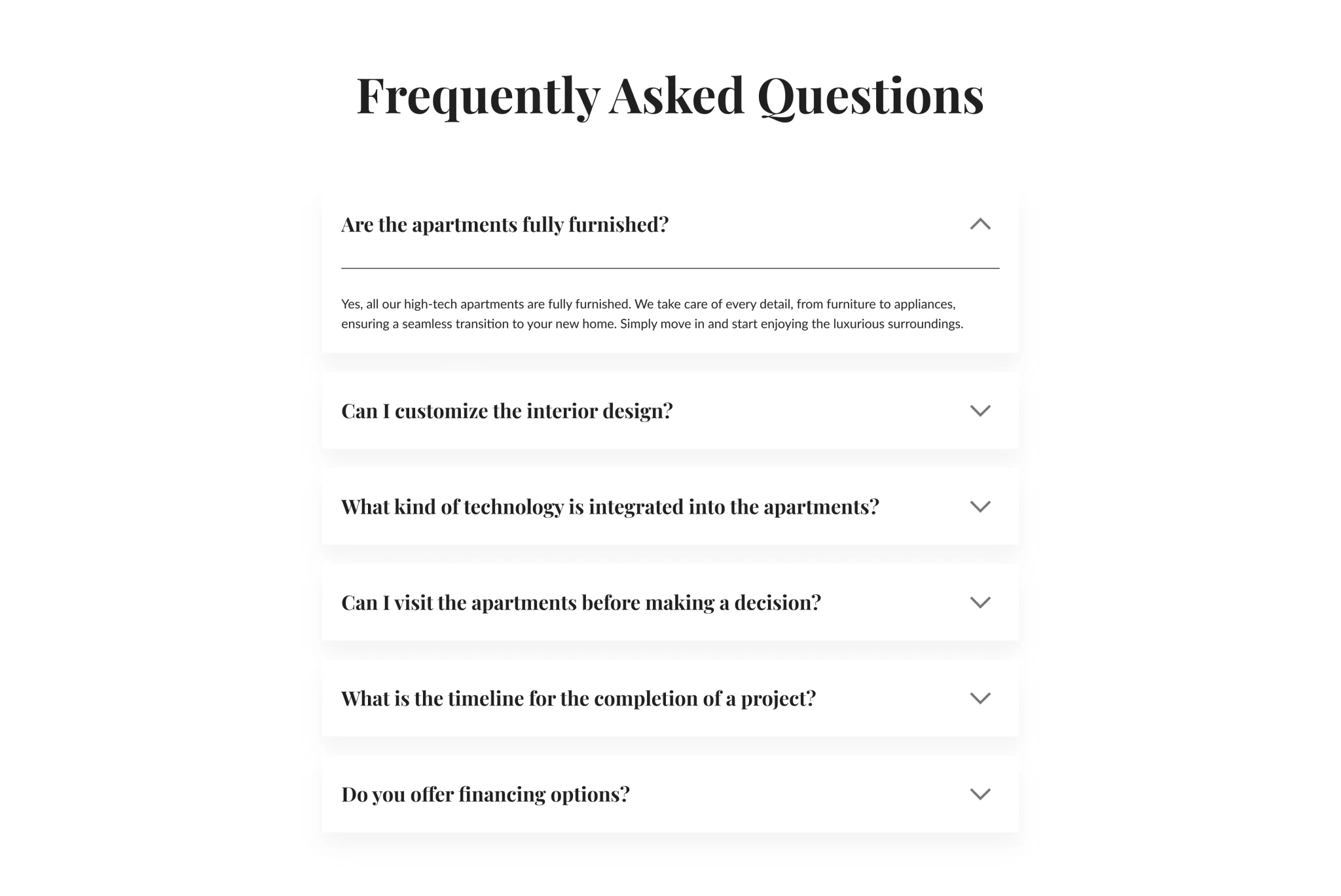
FAQ (Frequently Asked Questions) Section
- Answers to the most frequent questions according to the user persona analysis.
- FAQs provide quick and easy access to answers, improving the overall user experience by saving visitors time and frustration.
- We have also implemented an accordion design for the FAQ section, which allows the users to display text content in a sliding accordion format.
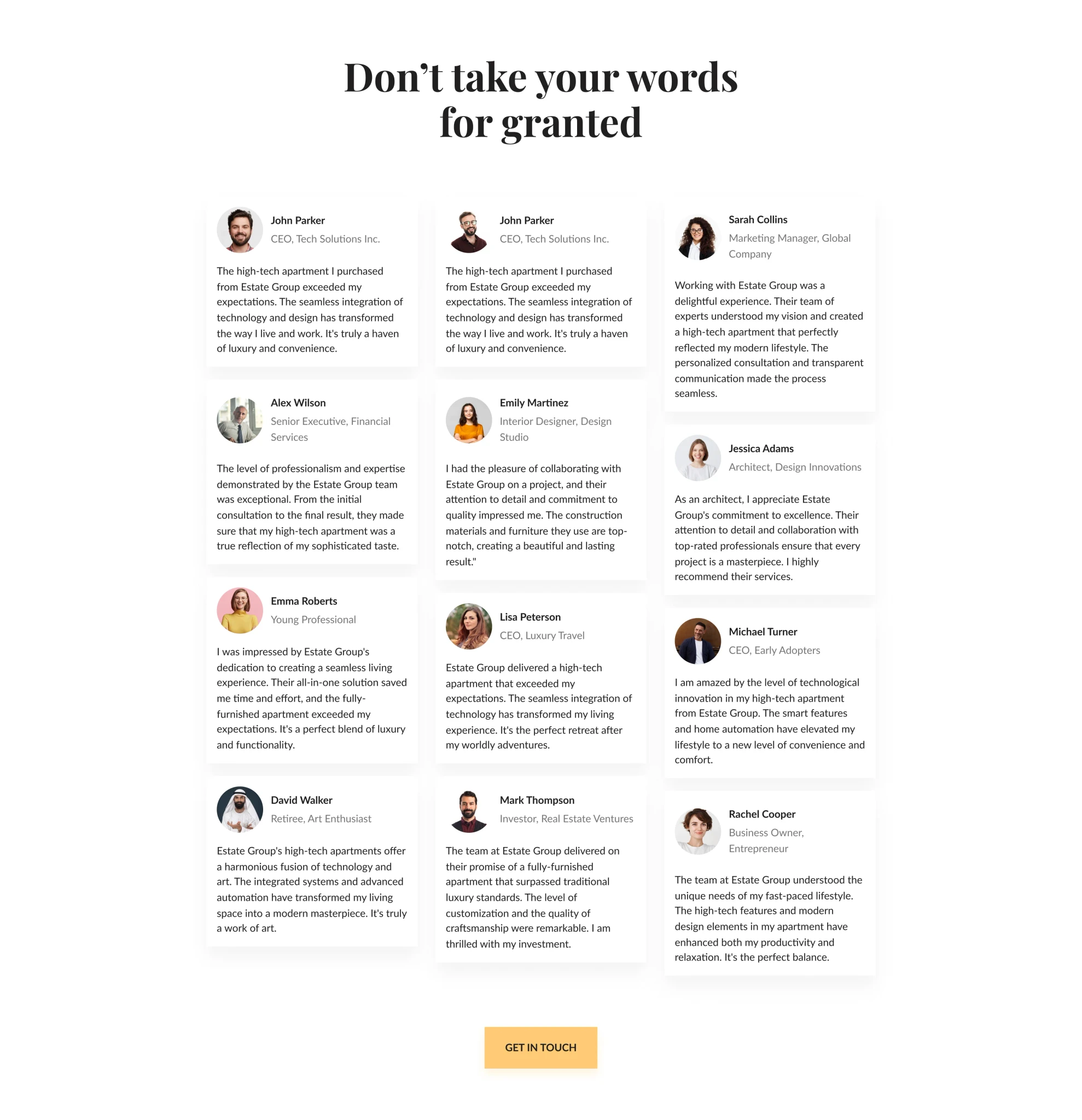
Testimonials Section
- Answers to the most frequent questions according to the user persona analysis.
- FAQs provide quick and easy access to answers, improving the overall user experience by saving visitors time and frustration.
- We have also implemented an accordion design for the FAQ section, which allows the users to display text content in a sliding accordion format.
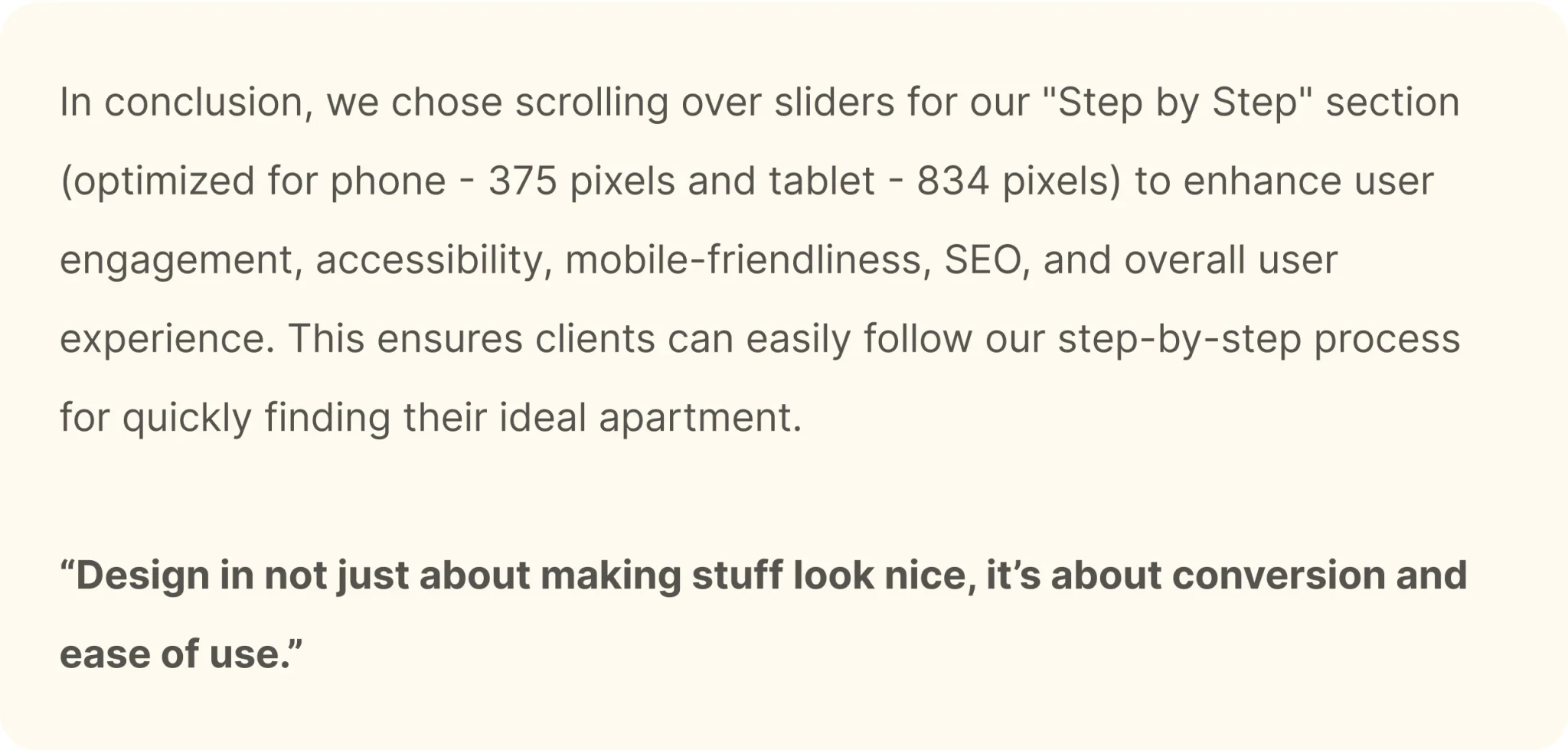
Evaluate and Testing
When it came to designing our website's "Step by Step" section for the phone version (375 pixels) and tablet version (834 pixels), we faced a pivotal decision - should we stick with the slider format or with a scroll-based design? After careful consideration and user testing, we decided to go with the scrolling approach, and here's why:
Easy to Use: Scrolling is effortless on phones and tablets, making it user-friendly.
Accessible to All: Scrolling works well for everyone, including those with disabilities.
Better for Search Engines: Scrolling helps search engines understand our content.
Looks Nice: Scrolling creates a clean and attractive design for our "Step by Step" section.
Users Like It: Our users prefer scrolling to sliders on both phones and tablets.
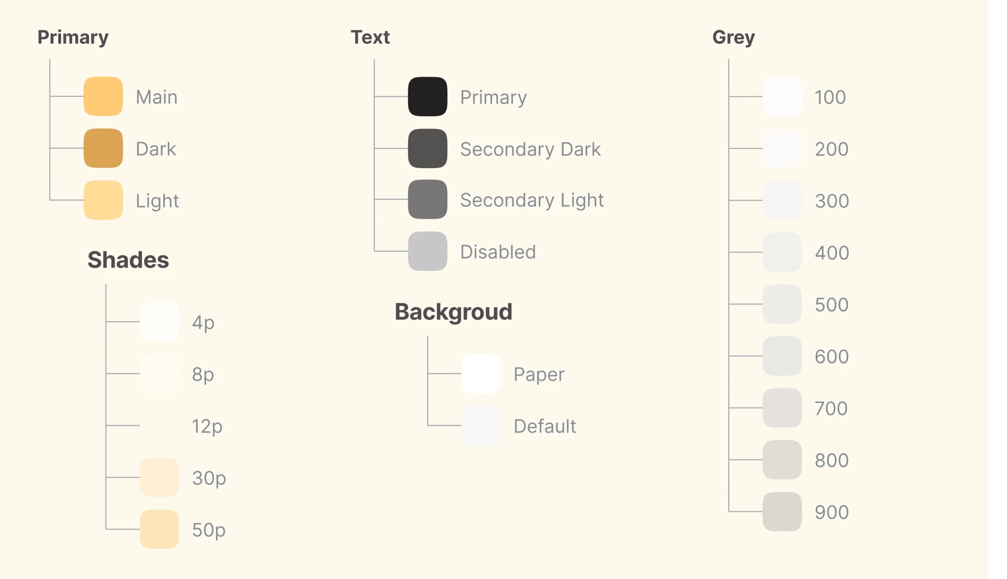
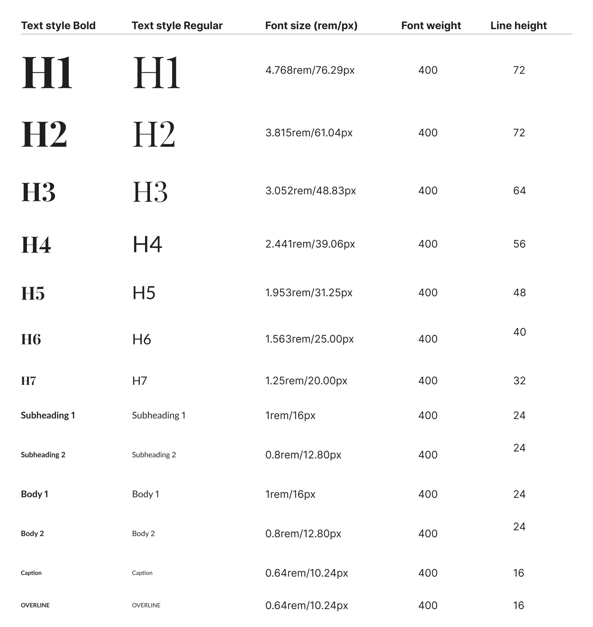
Style guide
After confirming the final design we developed a style guide to maintain consistency throughout the project and subsequent projects. Also, a style guide facilitates more effective communication with the engineers.
I have included the typographic system, the color palette created based on MUI, the components used, and the icons.
Colors
Colors
Icons
Icons
Components
Components
Typography: Playfair Display & Lato
Typography: Playfair Display & Lato
Handoff
Finally, I have successfully organized the file in a highly intuitive manner. In addition to this, I have also included the final design along with the responsive version, providing detailed specifications of the sizes used.
To ensure complete understanding and seamless implementation, I have arranged a call with the developer. This call will serve as an opportunity to provide any additional details about the site that may be necessary for its implementation.
UI Design
Once I confirmed the structure of the site, I created the design of the first two sections in several variations to identify which style fits best. I tried both the luxury and user-friendly styles. In the end I chose the Luxury style as it better represents the company image and the product offered.
UI Design
Before starting to design UI, I looked for inspiration on Dribbble, Behance, and Pinterest and created an inspirational mood board. It helped me avoid the creative block and saved a lot of time during the design process.
After several rounds of iterations, I came to this design.