Dashboard Design Solution for a Coding Academy
Dashboard Design Solution for a Coding Academy
Dashboard
Dashboard
Tools
Figma
Miro
Adobe Photoshop
Notion
4 weeks
Time frame
UX/UI Designer
Role
Desktop, Tablet & Mobile
Platform
Introduction
Introduction
ProCode Academy is an online coding institution dedicated to equipping individuals with the essential skills for success in the digital realm. With over 1,000+ students enrolled, the academy stands out with expert-led courses that provide a dynamic and tailored learning experience.
ProCode Academy is an online coding institution dedicated to equipping individuals with the essential skills for success in the digital realm. With over 1,000+ students enrolled, the academy stands out with expert-led courses that provide a dynamic and tailored learning experience.
Problem
Problem
The absence of a dedicated online platform has significantly hindered the academy’s ability to attract and engage students. Without an effective dashboard, prospective learners struggle to find course information, enroll seamlessly, and experience the tailored learning offers. This lack of an online presence has led to 40% fewer student inquiries and a 35% lower enrollment rate compared to industry benchmarks.
The absence of a dedicated online platform has significantly hindered the academy’s ability to attract and engage students. Without an effective dashboard, prospective learners struggle to find course information, enroll seamlessly, and experience the tailored learning offers. This lack of an online presence has led to 40% fewer student inquiries and a 35% lower enrollment rate compared to industry benchmarks.
Goal
Goal
Design a user-friendly and visually appealing dashboard to increase student inquiries by 30% and improve enrollment rates by 25%. The dashboard will also reduce navigation time by 20%, showcasing courses effectively and streamlining the enrollment process.
Design a user-friendly and visually appealing dashboard to increase student inquiries by 30% and improve enrollment rates by 25%. The dashboard will also reduce navigation time by 20%, showcasing courses effectively and streamlining the enrollment process.
My role
My role
As the UX/UI designer, I conducted competitor research, developed user personas, created wireframes and prototypes, designed UI elements, and managed the handoff to developers.
As the UX/UI designer, I conducted competitor research, developed user personas, created wireframes and prototypes, designed UI elements, and managed the handoff to developers.
My process
My process
The structure and length of my process depend on at which point I join the team, the resources available, and the deadlines. For this project, I focused only on the first four phases of my product design process.
The structure and length of my process depend on at which point I join the team, the resources available, and the deadlines. For this project, I focused only on the first four phases of my product design process.
Market Research
Market Research
User research indicates that prospective students prioritize easy access to course information, a seamless enrollment process, and robust communication channels. Analyzing competitors such as Codecademy, Udacity, and Coursera, we identified that key factors for attracting and retaining students include effective course presentation, intuitive navigation, and user-friendly enrollment processes.
User research indicates that prospective students prioritize easy access to course information, a seamless enrollment process, and robust communication channels. Analyzing competitors such as Codecademy, Udacity, and Coursera, we identified that key factors for attracting and retaining students include effective course presentation, intuitive navigation, and user-friendly enrollment processes.
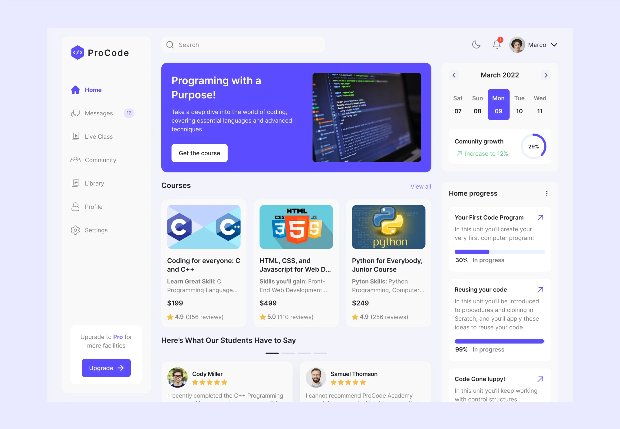
Final Design
Final Design
The redesigned dashboard offers intuitive navigation, captivating course displays, and a simplified enrollment process. Enhanced with clear communication elements and a responsive design, it ensures accessibility across all devices. This design aims to improve user experience, build trust, and facilitate easy access to the academy’s courses and resources.
The redesigned dashboard offers intuitive navigation, captivating course displays, and a simplified enrollment process. Enhanced with clear communication elements and a responsive design, it ensures accessibility across all devices. This design aims to improve user experience, build trust, and facilitate easy access to the academy’s courses and resources.